Introduction
Creating a stunning interior starts with choosing the right Color Harmony Palettes. Whether you’re refreshing a single room or redesigning your entire home, understanding how colors work together can transform your space from ordinary to extraordinary. The perfect color palette combinations bring balance, mood, and personality to your interiors. In this comprehensive guide, we’ll explore 17 inspiring color harmony ideas that will help you create stylish, cohesive spaces that reflect your unique taste and elevate your home’s aesthetic appeal.
Color Harmony Palettes Ideas
Understanding Color Harmony Palettes is essential for creating visually appealing interiors. These carefully curated combinations follow color theory principles to ensure that hues complement rather than clash with each other. When selecting your palette, consider the 60-30-10 rule: 60% dominant color, 30% secondary color, and 10% accent color.
This approach creates visual balance and prevents overwhelming your space. Monochromatic schemes use varying shades of a single color for sophisticated simplicity, while complementary palettes pair opposite colors on the wheel for dynamic contrast. Analogous combinations feature neighboring colors for harmonious, flowing designs that feel naturally cohesive throughout your space.
Room Color Harmony Inspiration

Drawing inspiration for Color Harmony Palettes from nature, art, and architecture can spark creativity. Look at how sunset gradients blend warm oranges with soft pinks, or how coastal environments combine sandy beiges with ocean blues. Museums and galleries offer endless color combination inspiration through masterful paintings and installations.
Travel photography, fashion runways, and even food presentation can reveal unexpected yet beautiful color palette combinations. Create a mood board with images that resonate with your style, then identify the dominant colors. This visual exercise helps you discover patterns in your preferences and guides you toward palettes that truly represent your aesthetic vision for each room in your home.
Interior Color Balance Tips

Achieving balance with Color Harmony Palettes requires understanding visual weight and distribution. Darker colors feel heavier and advance toward the viewer, while lighter shades recede and create spaciousness. Distribute colors strategically throughout your room to maintain equilibrium.
Anchor your space with darker tones on larger furniture pieces or accent walls, then layer in lighter shades through textiles and accessories. Repeat your chosen colors at least three times throughout the room to create cohesive flow. This repetition strengthens the harmony and makes your color scheme feel intentional rather than random.
Modern Color Harmony Schemes
Modern Color Harmony Palettes embrace both bold contrasts and subtle sophistication. Contemporary schemes often feature clean whites paired with charcoal grays and punctuated by vibrant jewel tones like emerald or sapphire. These combinations create dramatic yet refined spaces that feel current and stylish.
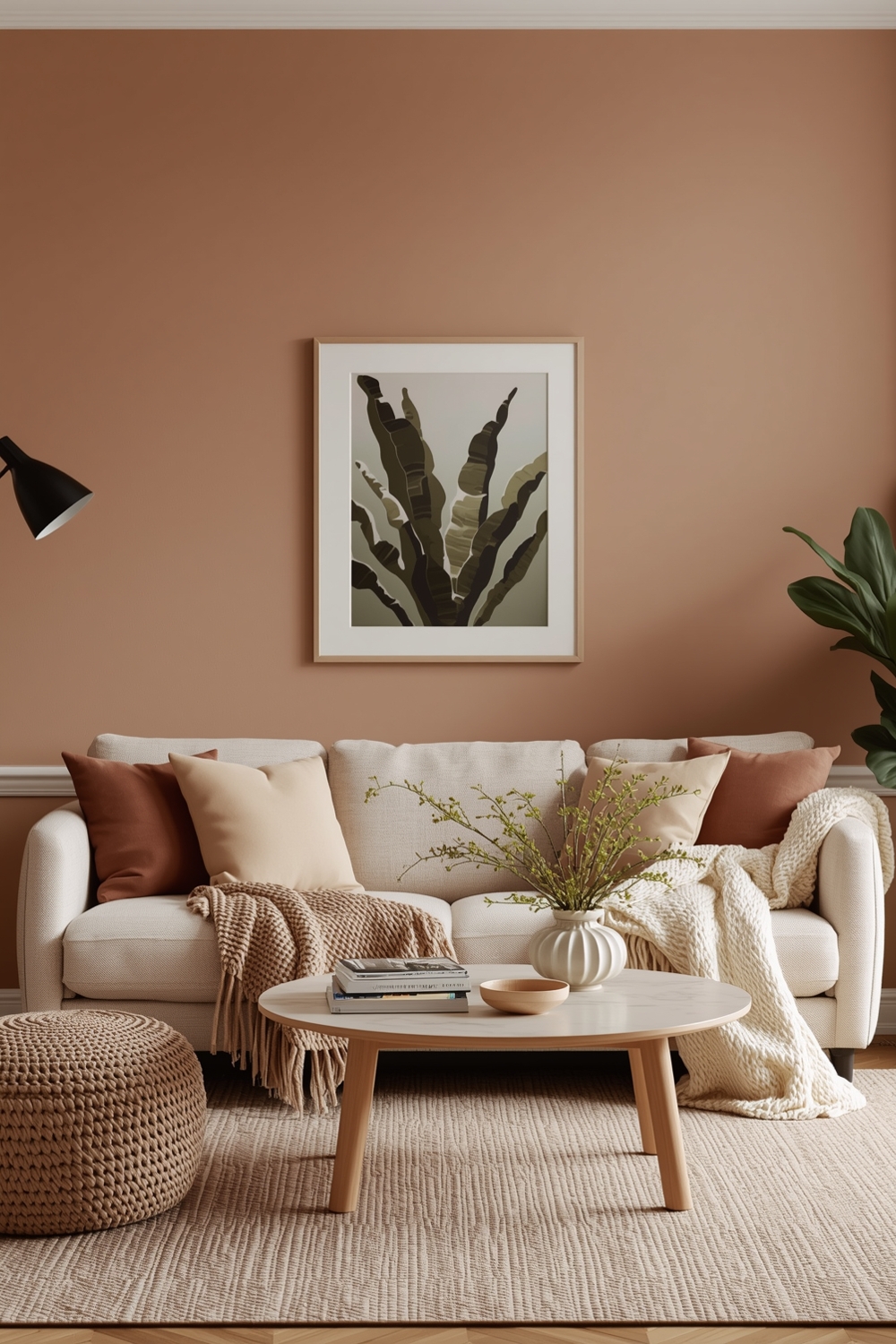
Alternatively, modern palettes might showcase warm terracotta with sage green and cream for an earthy, organic feel. The key to modern color harmony lies in restraint—limiting your palette to three or four main colors prevents visual chaos. Add depth through texture rather than additional colors for a sophisticated, contemporary aesthetic.
Stylish Color Combinations
Stylish color palette combinations reflect current trends while maintaining timeless appeal. Navy blue paired with blush pink and gold accents creates elegant sophistication perfect for bedrooms or living rooms. Forest green combined with mustard yellow and cream brings warmth and character to dining spaces.
For a fresh, contemporary look, try soft gray with coral and white—this combination feels light and energizing. Burgundy with olive green and ivory offers rich depth ideal for cozy studies or libraries. The most stylish combinations balance trendiness with personal taste, ensuring your space remains beautiful beyond fleeting design fads while expressing your individual personality.
Neutral and Bright Room Colors

Neutral Color Harmony Palettes provide versatile foundations that adapt to changing styles and seasons. Beige, gray, taupe, and white create calming backdrops that highlight architectural features and furnishings. Layer different neutral shades to add dimension without overwhelming your space.
Bright accent colors inject personality into neutral rooms. A crisp white room with cobalt blue pillows and artwork creates striking contrast. Greige walls paired with vibrant yellow throws energize spaces while maintaining sophistication. This approach allows you to update your interior’s mood simply by swapping accessories, making it both practical and economical.
Color Harmony Palettes for Living Spaces
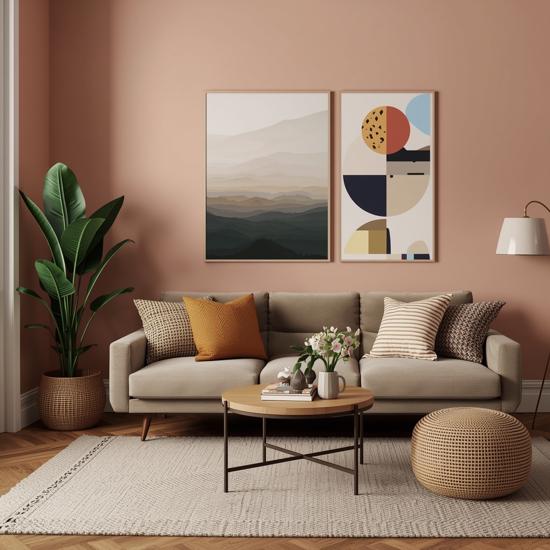
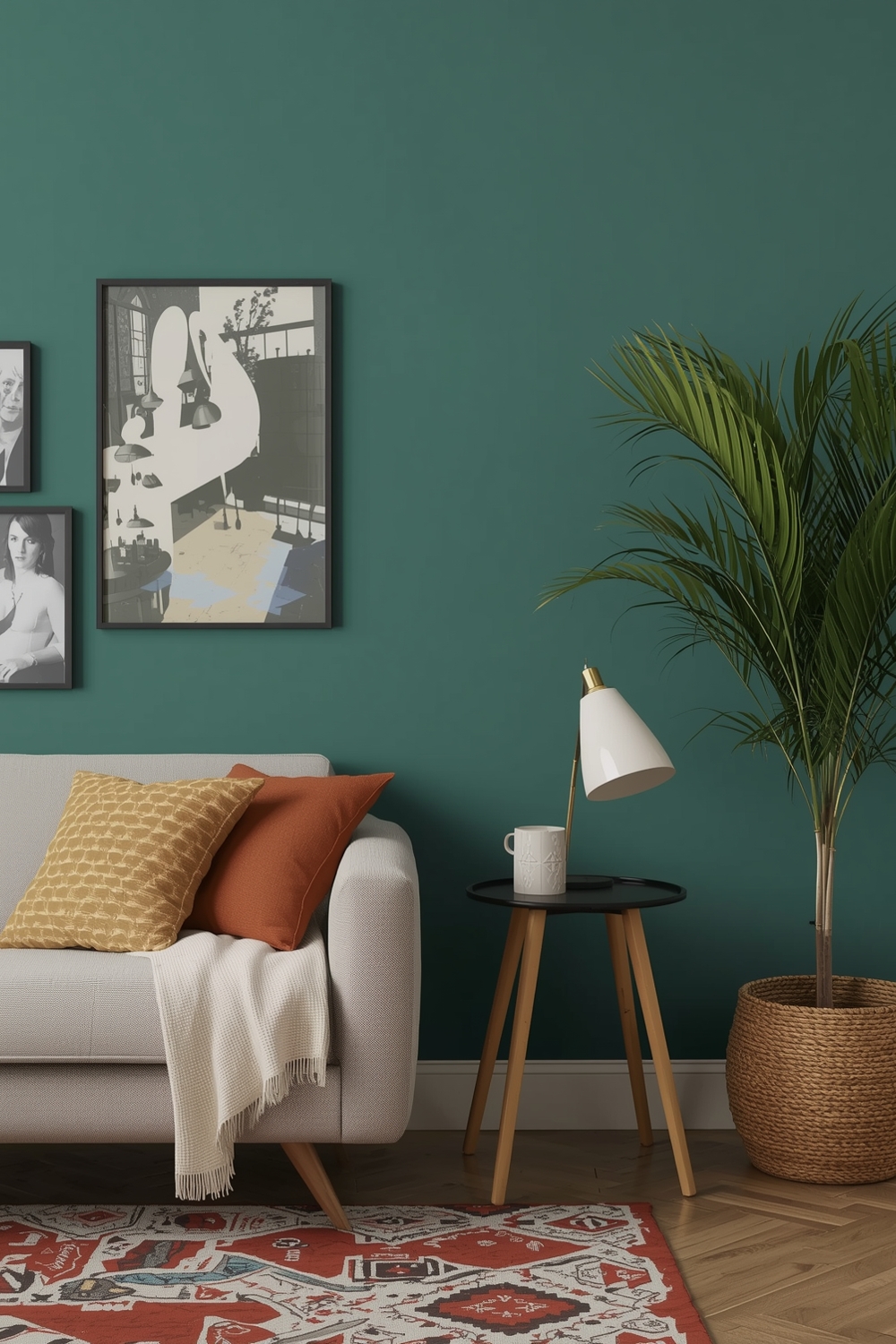
Living spaces benefit from welcoming Color Harmony Palettes that encourage relaxation and conversation. Warm palettes featuring terracotta, cream, and olive create inviting atmospheres perfect for family gatherings. Cool schemes with soft blues, grays, and whites promote tranquility and spaciousness.
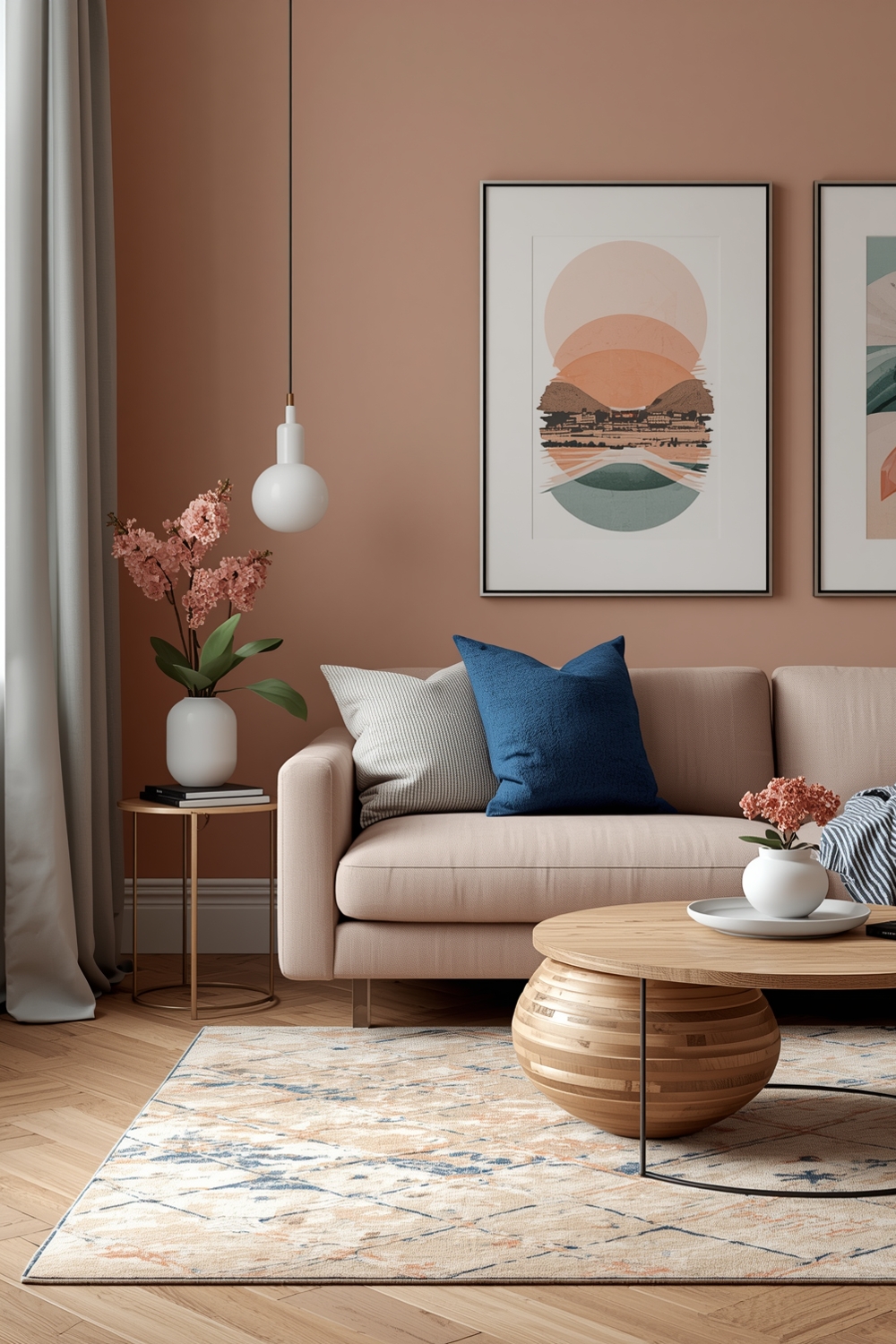
For multi-functional living areas, consider transitional palettes that bridge warm and cool tones—taupe with slate blue and soft gold works beautifully. These balanced combinations adapt to various lighting conditions throughout the day, maintaining their appeal from morning coffee to evening entertainment.
Color Harmony Accent Ideas
Accent colors within color palette combinations bring energy and focal points to your design. Use the 10% rule for accents—small doses of bold color create maximum impact without overwhelming. Incorporate accents through throw pillows, artwork, vases, or a single statement chair.
Metallic accents like brass, copper, or chrome add glamour while complementing your color scheme. Consider seasonal accent swaps to refresh your space—swap orange pillows for teal ones to transition from autumn to spring. This strategy keeps your interior feeling current and dynamic while maintaining your foundational palette’s harmony and cohesiveness throughout the year.
Functional Color Harmony Combinations

Functional Color Harmony Palettes consider how colors affect mood and productivity. Home offices benefit from blues and greens that enhance focus and reduce stress. Kitchens thrive with appetizing warm tones like reds, oranges, and yellows that stimulate energy.
Bedrooms require calming palettes—lavender with soft gray promotes restful sleep, while pale blue with cream creates serene retreats. Bathrooms shine with spa-like combinations of white, seafoam green, and natural wood tones. Aligning color choices with room function ensures your spaces not only look beautiful but also support their intended purpose effectively.
Elegant Color Harmony Layouts
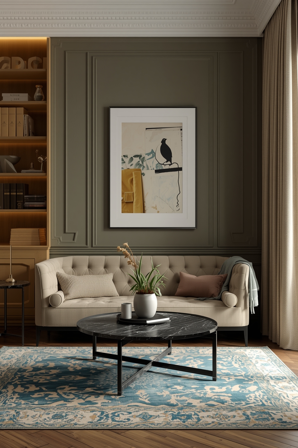
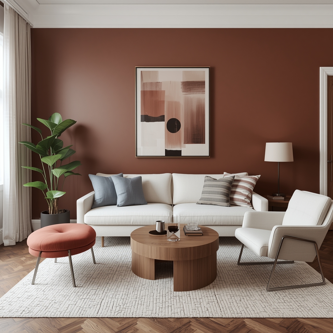
Elegant Color Harmony Palettes exude sophistication through carefully selected, refined combinations. Classic pairings like black and white with gold accents never go out of style. Deep plum with soft pink and cream creates luxurious femininity perfect for dressing rooms.
Navy with cream and brushed nickel conveys timeless elegance suitable for formal dining rooms. Chocolate brown paired with champagne and ivory brings warmth and richness to master suites. These upscale combinations rely on quality materials and thoughtful placement to achieve their refined, polished appearance that impresses guests.
Minimalist Room Color Harmony
Minimalist color palette combinations embrace simplicity with limited, carefully chosen hues. Monochromatic white schemes with varying textures create serene, uncluttered spaces. Adding one warm wood tone prevents starkness while maintaining minimalist principles.
Soft gray paired with black accents and white walls defines contemporary minimalism. These restrained palettes allow architectural elements and a few select furnishings to shine without competition. The beauty of minimalist color harmony lies in its ability to make small spaces feel larger and busy lives feel calmer. Every color choice serves a purpose, contributing to an intentional, peaceful environment.
Contemporary Color Harmony Designs
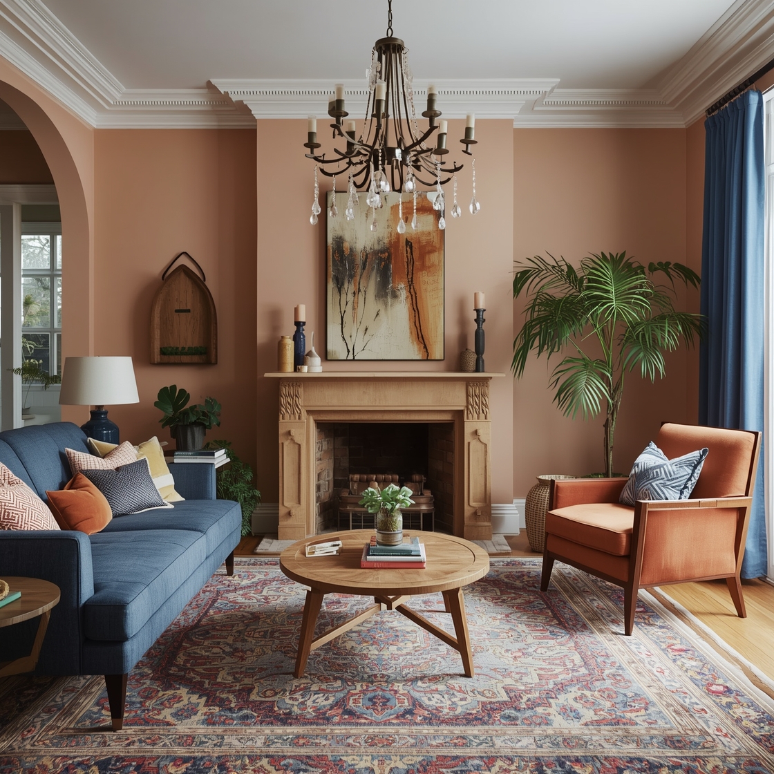
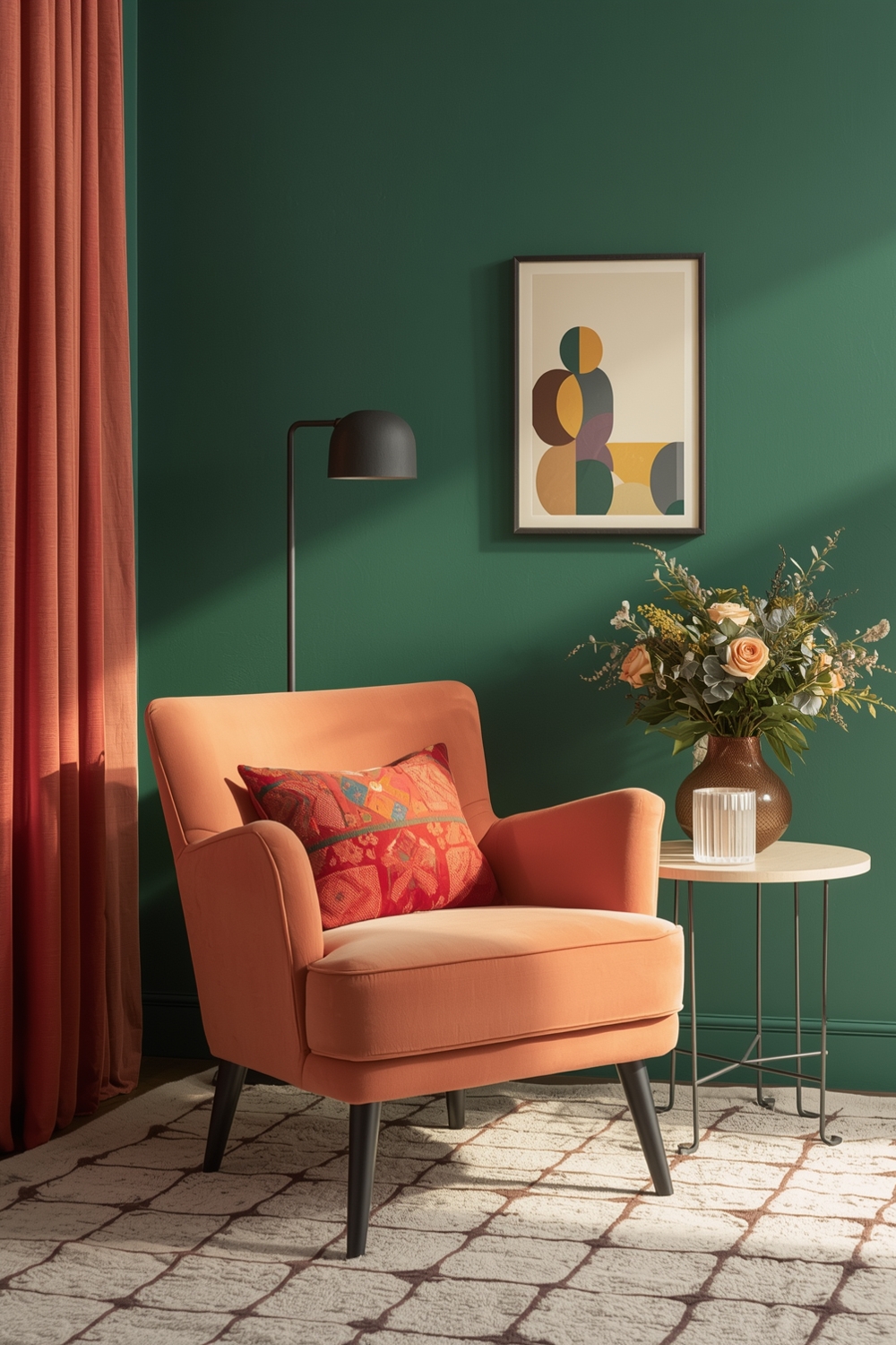
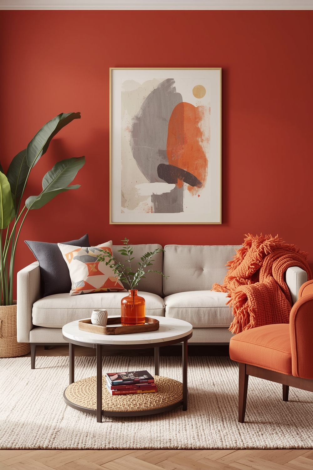
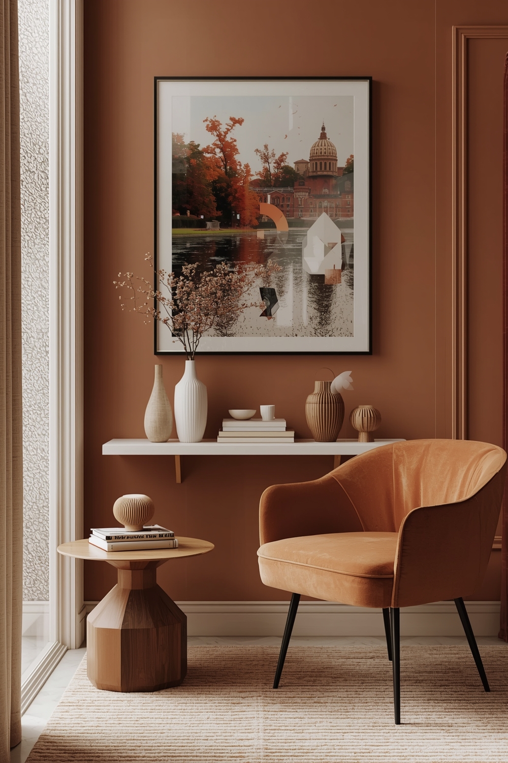
Contemporary Color Harmony Palettes push boundaries while maintaining livability. Unexpected combinations like dusty rose with charcoal and brass create modern sophistication. Teal paired with burnt orange and cream brings bold personality to family rooms without overwhelming.
Current trends favor earth-inspired palettes—clay red with sage and sand reflects our connection to nature. Jewel-tone combinations featuring emerald, sapphire, and amethyst with neutral backgrounds add drama and luxury. Contemporary designs balance artistic expression with functionality, creating spaces that feel fresh, current, and uniquely personal while remaining comfortable for everyday living.
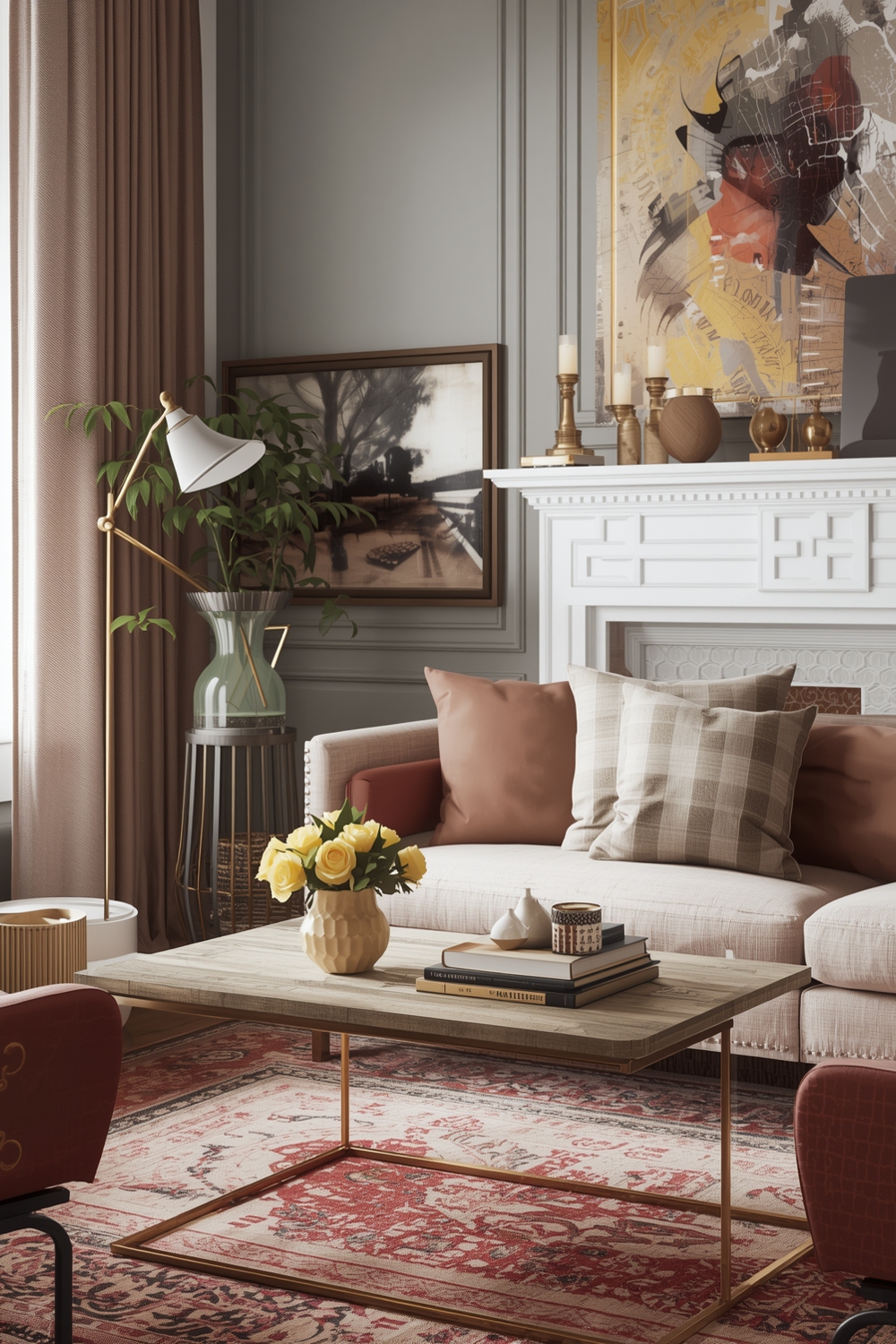
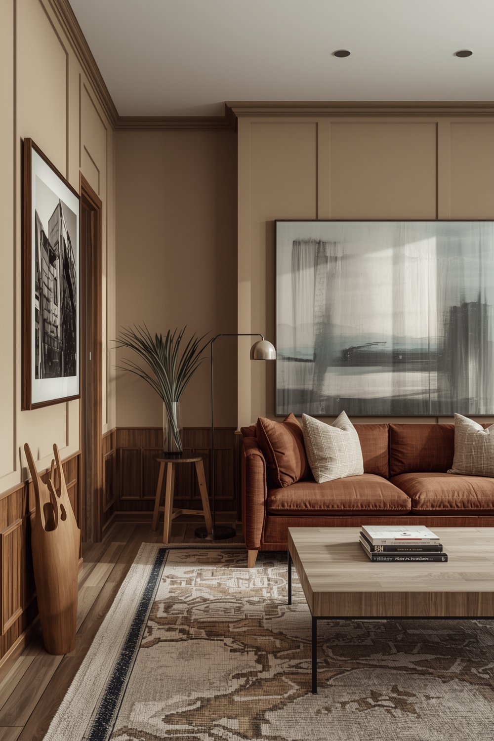
Cozy and Balanced Color Palettes
Cozy Color Harmony Palettes wrap spaces in warmth and comfort. Rich caramel combined with cream and forest green creates inviting retreats perfect for reading nooks. Burgundy with gold and taupe brings enveloping warmth to living rooms.
Balanced palettes prevent coziness from becoming dark or oppressive. Mix warm tones with enough lighter shades to maintain brightness—rust orange with soft white and pale gray achieves this equilibrium beautifully. These welcoming combinations make guests feel immediately comfortable and encourage family members to gather and linger.
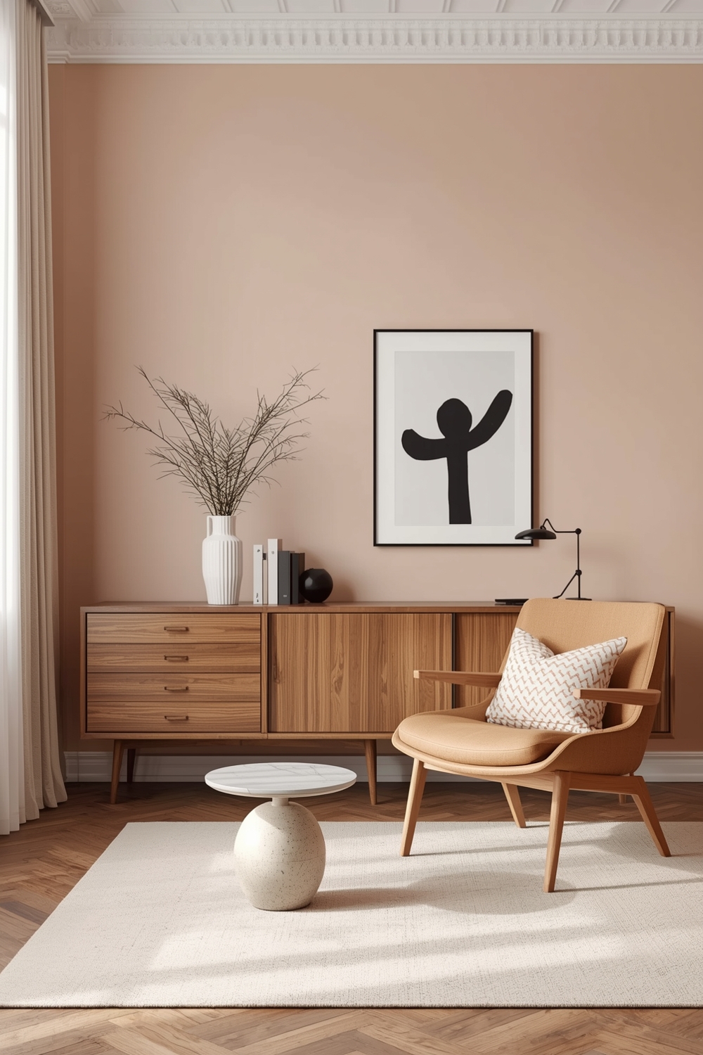
Room Color Harmony for Modern Interiors
Modern interiors thrive on clean-lined color palette combinations that emphasize simplicity. Stark white with black accents and one bright color creates striking contemporary spaces. Concrete gray paired with warm wood tones and greenery brings industrial-modern appeal.
For softer modern aesthetics, try pale pink with gray and marble white. These sophisticated palettes complement sleek furniture and open floor plans characteristic of modern architecture. The key is maintaining simplicity—limiting your palette allows architectural features and carefully selected furnishings to become focal points.
Timeless Color Harmony Ideas

Timeless Color Harmony Palettes transcend trends, remaining beautiful for decades. Classic combinations like cream and navy create enduring elegance. Soft white with warm gray and natural wood tones adapt to changing decor styles while maintaining their fundamental appeal.
Sage green paired with cream and gold brings nature-inspired tranquility that never feels dated. These palettes work across design styles from traditional to transitional, offering flexibility as your tastes evolve. Investing in timeless color harmony ensures your interior remains sophisticated and relevant, saving you from costly redesigns while maintaining a beautiful, cohesive home environment that stands the test of time.
How This Idea Improves Your Space
Implementing thoughtful color harmony transforms your interior’s atmosphere and functionality. Proper color selection can make small rooms feel larger, dark spaces brighter, and cold rooms warmer. Harmonious palettes reduce visual stress, creating environments that promote relaxation and well-being. They also increase your home’s perceived value by presenting a polished, professionally designed appearance. Strategic color choices highlight your best features while downplaying imperfections, ultimately creating a cohesive home that reflects your personality while enhancing daily life quality.
Budget-Friendly Tips
Achieving beautiful color harmony doesn’t require expensive renovations. Start with paint—the most cost-effective transformation available. Focus accent colors on small, changeable items like pillows, throws, and artwork rather than major furniture investments. Shop secondhand for statement pieces in your chosen palette. Use painter’s tape to test color placement before committing, and consider one statement wall rather than painting entire rooms.
Conclusion
Creating stunning interiors with perfect color harmony elevates your home’s aesthetic while reflecting your personal style. These 17 palette ideas provide inspiration for every room and design preference, from minimalist to cozy. Remember that successful color harmony balances proportion, function, and personal taste. Start with a foundation you love, layer complementary tones, and add personality through carefully chosen accents for a beautifully cohesive home.
FAQs
What is the 60-30-10 color rule?
This design principle suggests using 60% dominant color, 30% secondary color, and 10% accent color to create balanced, harmonious interiors.
How many colors should I use in a room?
Limit your palette to 3-4 main colors plus neutrals to prevent visual overwhelm while maintaining interest and depth throughout your space.
Can I mix warm and cool colors?
Yes! Transitional palettes that bridge warm and cool tones create sophisticated, balanced spaces that work in various lighting conditions.
How do I choose accent colors?
Select accent colors opposite your dominant color on the color wheel for maximum impact, or choose a brighter version of your secondary color.
What’s the easiest color harmony for beginners?
Monochromatic schemes using varying shades of one color with white or neutral accents offer foolproof harmony perfect for design beginners.