Introduction
Choosing the right Interior Paint Palette can transform your home from ordinary to extraordinary. The perfect color combination sets the mood, enhances natural light, and reflects your personal style. Whether you’re looking for calming neutrals or bold statement colors, finding the right interior wall color ideas is essential for creating spaces you’ll love. This comprehensive guide explores 16 proven paint palette combinations that work beautifully in any home, helping you make confident color choices for every room.
Interior Paint Palette Ideas
Creating a cohesive Interior Paint Palette starts with understanding color theory and how different hues interact. The best palettes typically include a dominant color, secondary shade, and accent tones that complement each other harmoniously.
Consider your home’s architectural features, natural lighting, and existing furniture when selecting colors. A well-planned palette creates visual flow throughout your space while allowing each room to maintain its unique character. Test paint samples on your walls at different times of day to see how natural and artificial light affects the colors before making your final decision.
Modern Room Paint Colors
Modern paint palettes embrace clean lines and sophisticated simplicity. Think crisp whites paired with charcoal grays, or soft beiges combined with matte black accents. These contemporary combinations create striking contrasts while maintaining an elegant, uncluttered aesthetic.
Popular modern choices include warm greige tones, dusty blues, and sage greens that bring nature indoors. Add metallic accents in gold or brushed nickel to enhance the modern feel. These interior wall color ideas work exceptionally well in open-concept spaces where color continuity matters.
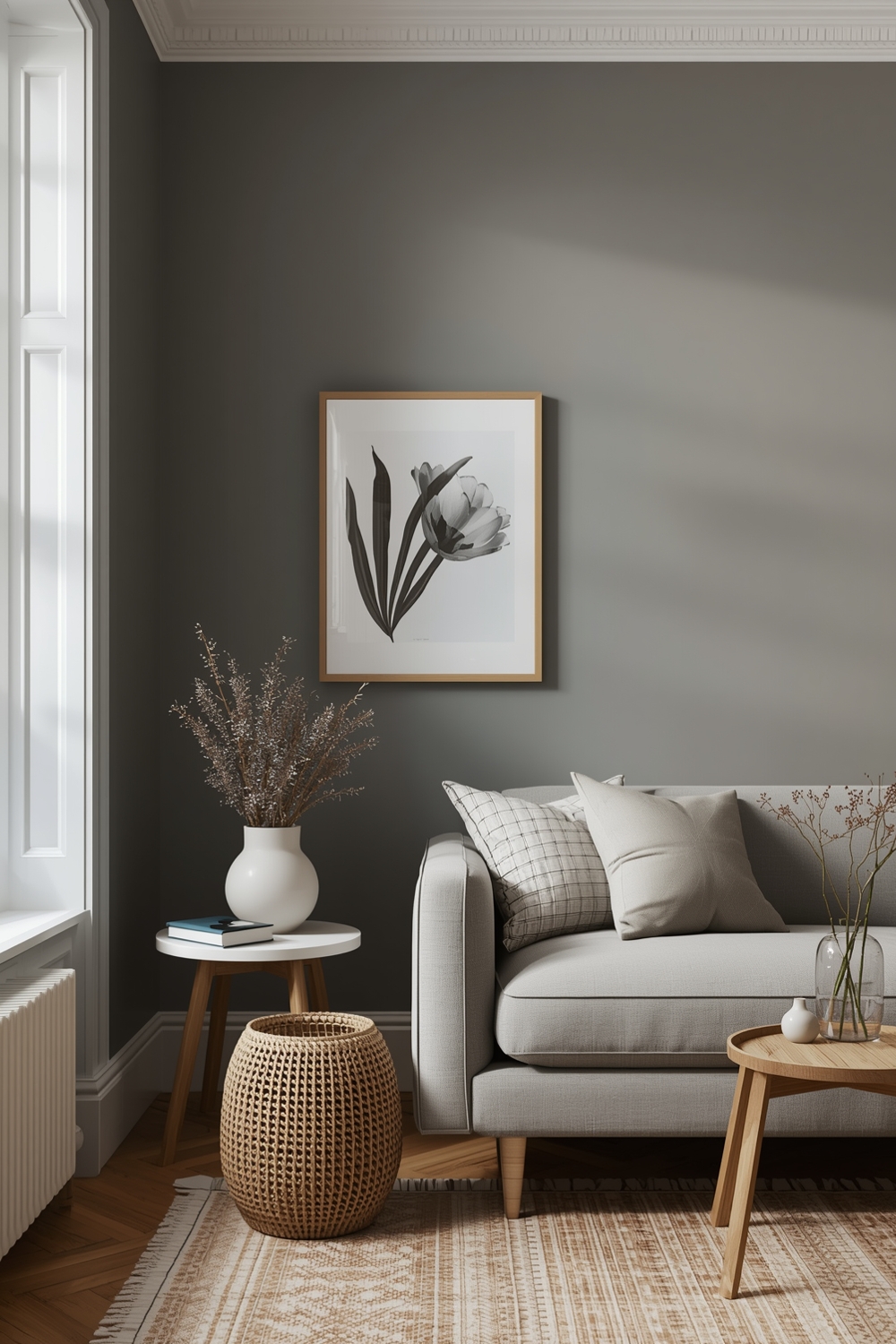
Neutral Room Paint Palettes
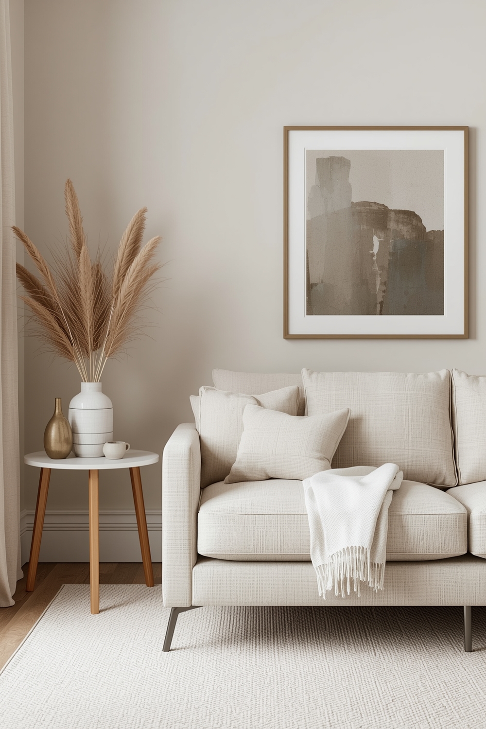
Neutral palettes never go out of style and provide the perfect backdrop for any décor. Classic combinations like ivory and taupe, or cream and soft gray, create timeless elegance that adapts to changing trends. These versatile shades make rooms feel larger and more inviting.
Layer different neutral tones to add depth and interest without overwhelming the senses. Combine warm and cool neutrals strategically to create subtle contrast that feels sophisticated and intentional.
Bright Room Paint Combinations
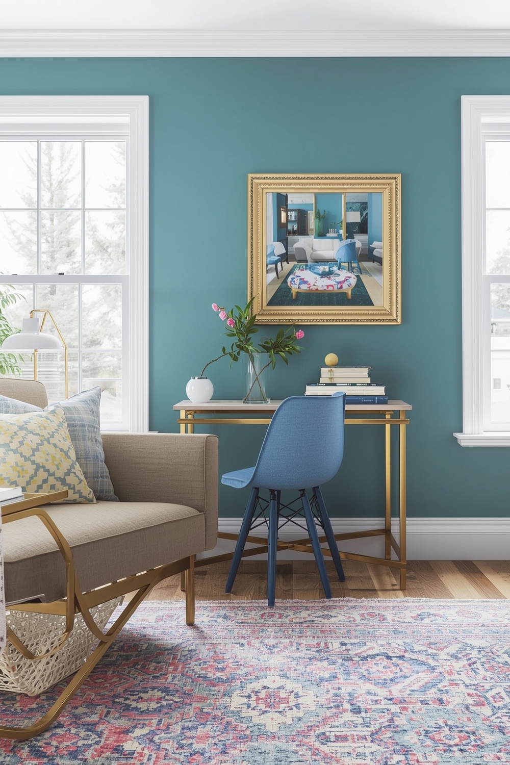
Bright color combinations inject energy and personality into your living spaces. Consider pairing sunny yellow with crisp white, or vibrant coral with soft cream for an uplifting atmosphere. These cheerful palettes work wonderfully in kitchens, playrooms, and home offices where you want to boost creativity and mood.
Balance bold colors with neutral anchors to prevent visual overload. Use the 60-30-10 rule: 60% dominant color, 30% secondary color, and 10% accent shade for professional-looking results.
Minimalist Interior Paint Ideas
Minimalist paint palettes focus on simplicity and restraint. Monochromatic schemes using varying shades of one color create serene, cohesive spaces that feel intentionally curated. White-on-white combinations with subtle texture variations exemplify minimalist elegance.
Consider soft grays, pale blues, or muted greens for a minimalist approach that still offers visual interest. These understated Interior Paint Palette choices emphasize form and function while creating peaceful environments. Keep accent colors minimal and purposeful to maintain the clean aesthetic that defines minimalist design.
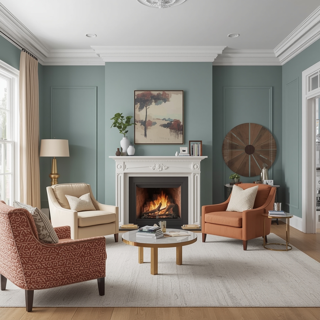
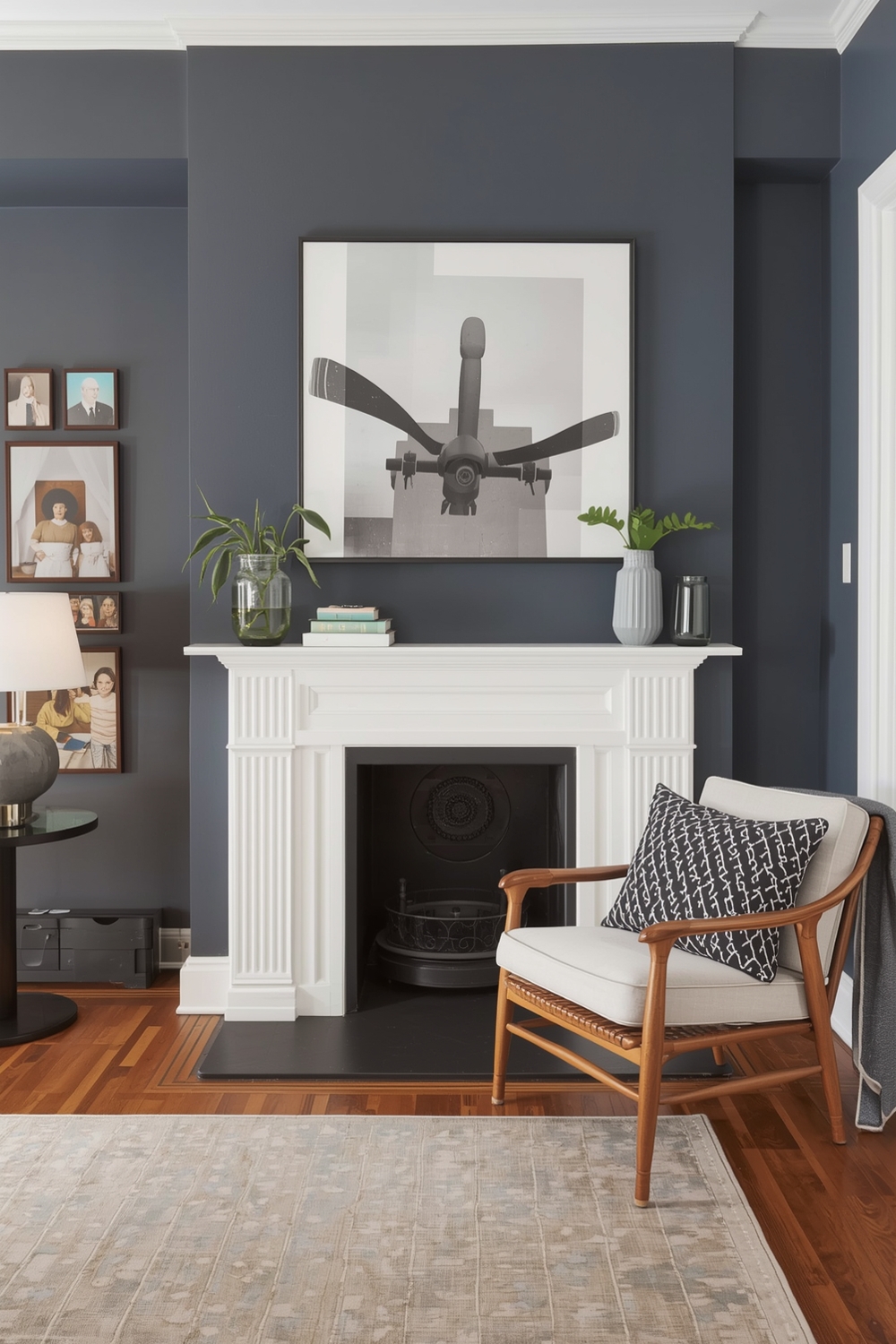
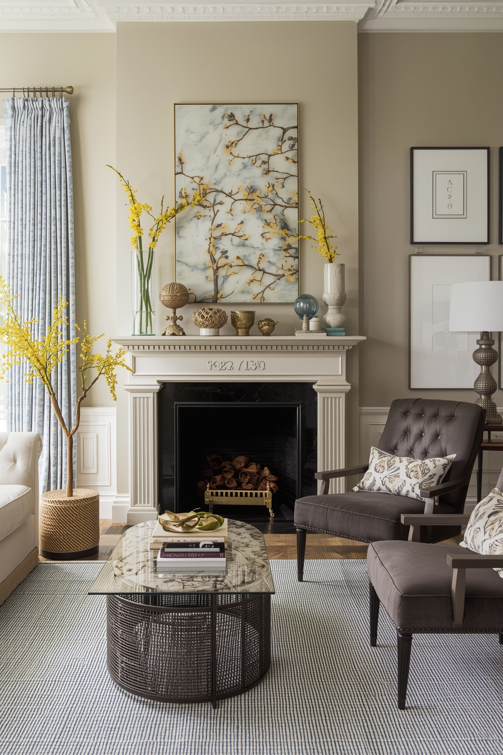
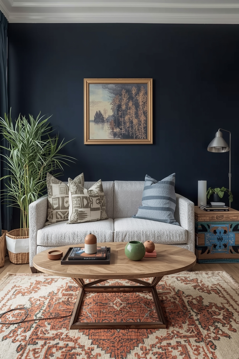
Elegant Room Color Schemes
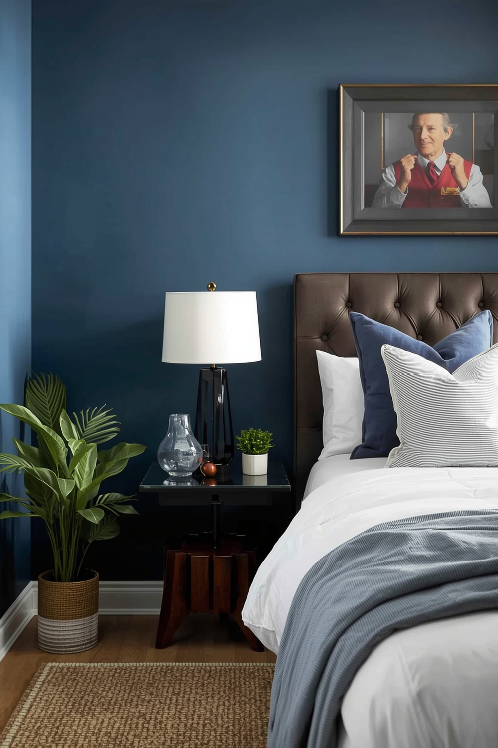
Elegant palettes combine rich, sophisticated hues that exude luxury. Navy blue paired with gold accents, or deep emerald green with brass fixtures, creates refined spaces worthy of design magazines. These combinations work beautifully in dining rooms, master bedrooms, and formal living areas.
Add texture through paint finishes—mix matte walls with satin trim for subtle elegance. Consider jewel tones like sapphire, ruby, or amethyst for dramatic yet tasteful impact.
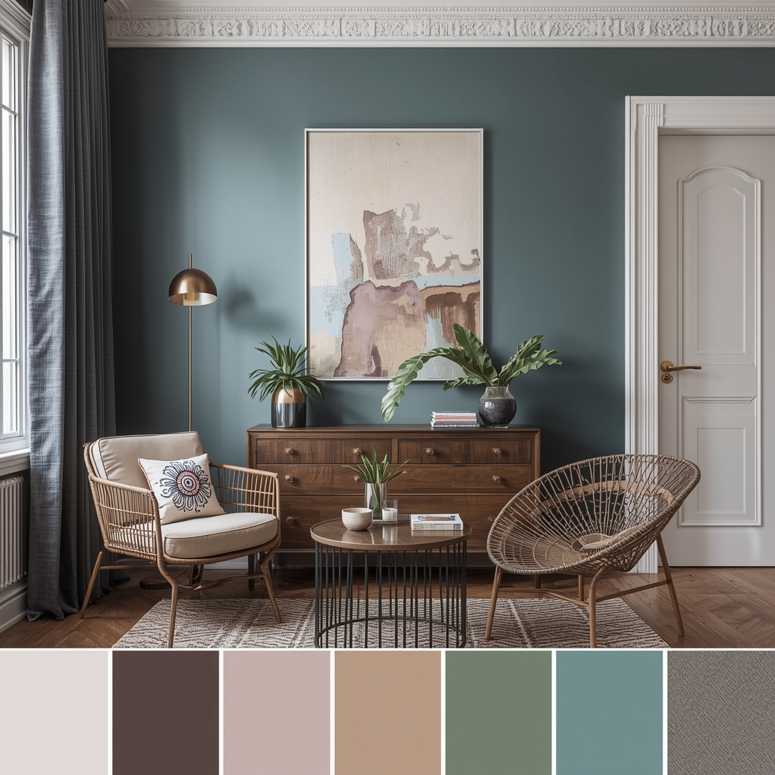
Contemporary Paint Palettes
Contemporary palettes reflect current design trends while maintaining broad appeal. Popular combinations include blush pink with gray, terracotta with cream, or navy with warm wood tones. These fresh approaches to color create spaces that feel current without being trendy.
Experiment with unexpected color pairings that challenge traditional rules. The contemporary aesthetic embraces individuality and creative expression through thoughtful color choices that reflect your unique style and personality.
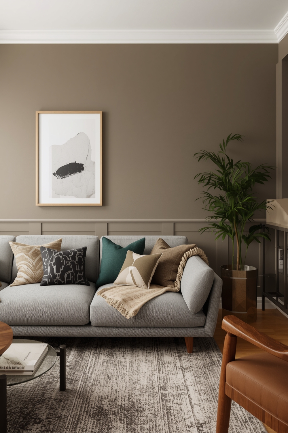
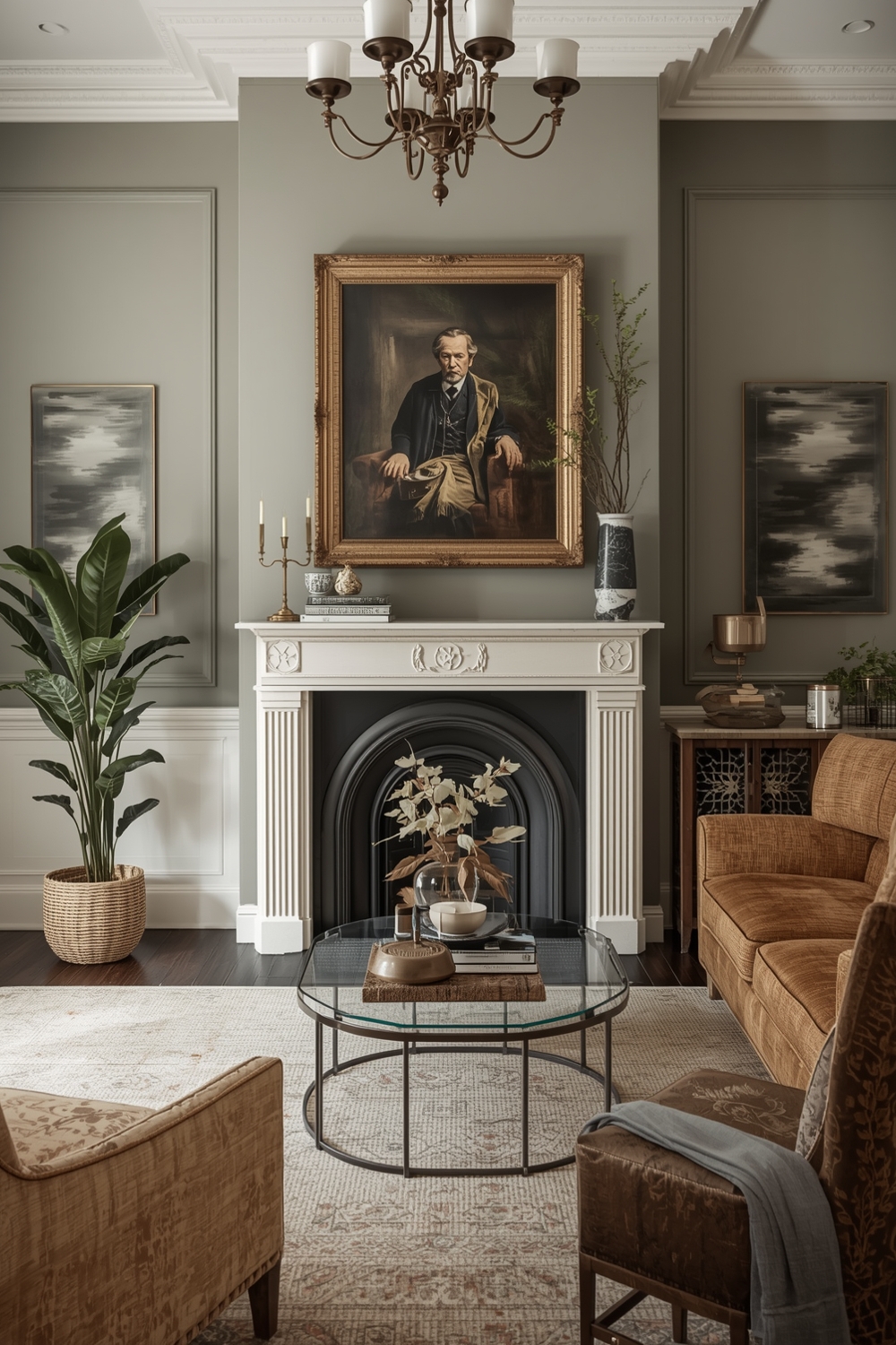
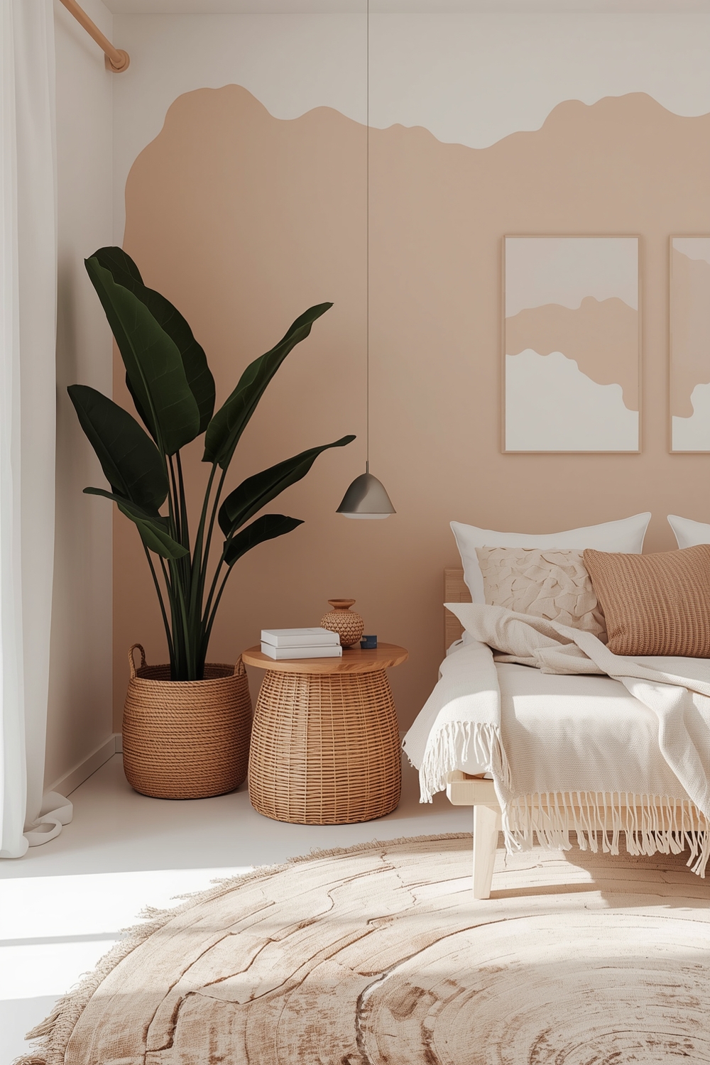
Cozy Room Paint Inspiration
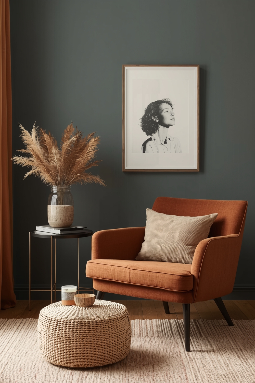
Cozy color combinations make spaces feel warm and welcoming. Think rich browns paired with burnt orange, or deep burgundy with cream accents. These inviting palettes work perfectly in family rooms, reading nooks, and bedrooms where comfort is paramount.
Layer warm earth tones to create depth and dimension. Add soft lighting and textured fabrics to enhance the cozy atmosphere created by your paint choices. These nurturing color schemes promote relaxation and make your home feel like a true sanctuary from the busy world outside.
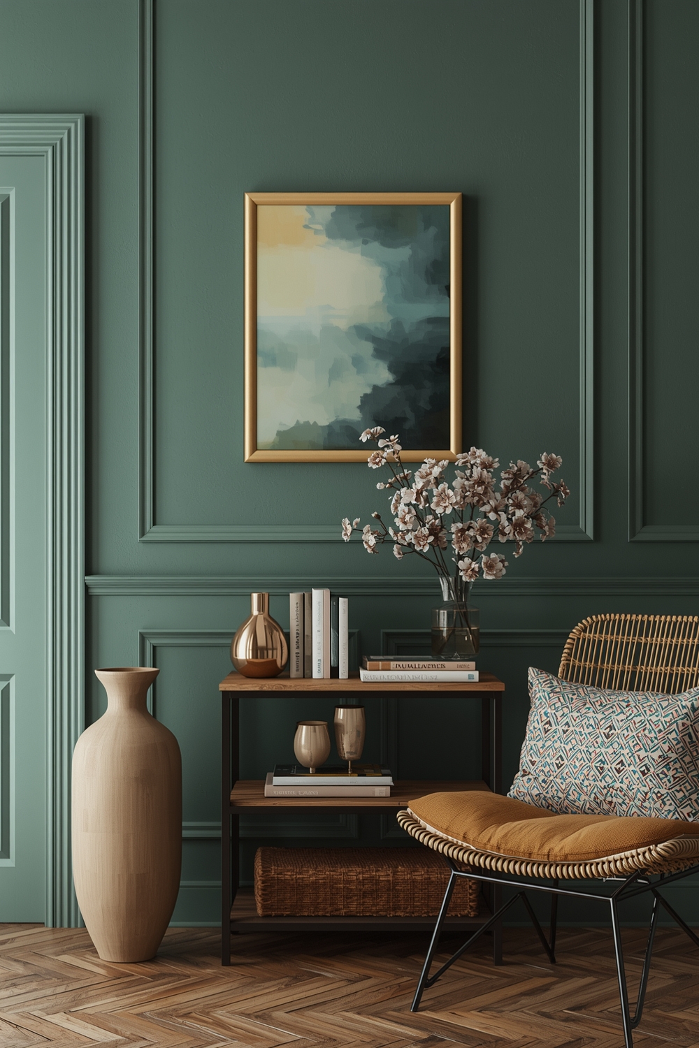
Room Accent Color Ideas
Accent colors add personality and visual interest to any Interior Paint Palette. Consider painting one feature wall in a bold hue while keeping other walls neutral. Popular accent colors include deep teal, mustard yellow, or brick red that create focal points without overwhelming the space.
Use accent colors strategically on architectural features like built-in shelving, door frames, or ceiling beams to highlight interesting elements and add character to your rooms.
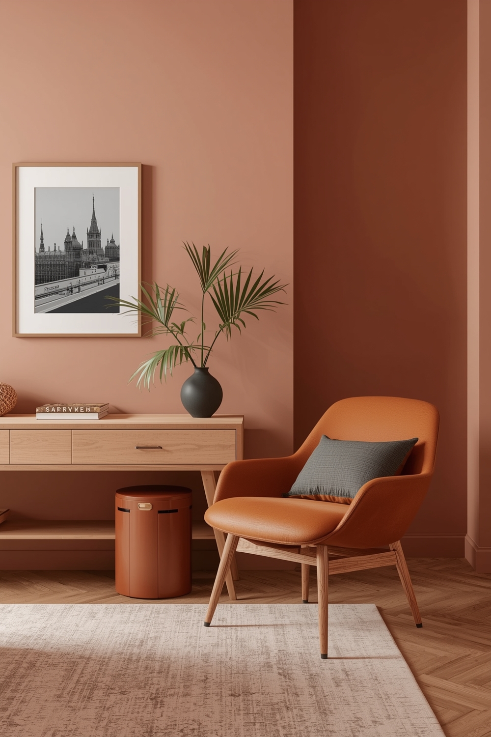
Interior Paint Colors with Warm Tones
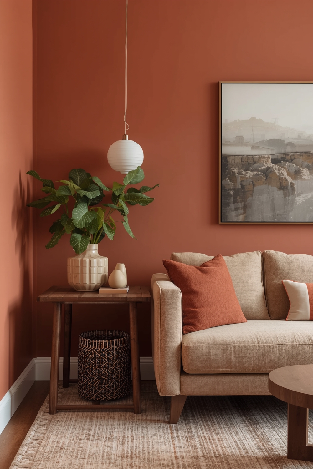
Warm-toned palettes create inviting, energetic spaces filled with life. Combinations like terracotta and peach, golden yellow and rust, or warm taupe and cinnamon bring sunshine indoors regardless of natural light. These colors work beautifully in north-facing rooms that need warmth.
Warm colors advance visually, making large rooms feel more intimate and cozy. They’re perfect for gathering spaces where you want to encourage conversation and connection among family and friends.
Cool Tone Room Paint Ideas
Cool-toned palettes create calm, serene environments perfect for relaxation. Think combinations like powder blue and white, soft lavender and gray, or seafoam green and cream. These refreshing colors work wonderfully in bedrooms, bathrooms, and meditation spaces where tranquility is desired.
Cool colors recede visually, making small rooms appear larger and more spacious. They’re ideal for south-facing rooms with abundant natural light that might otherwise feel too warm. Pair cool wall colors with warm accent pieces to prevent spaces from feeling cold or sterile.
Open Space Paint Palettes
Open-concept spaces require carefully planned color transitions. Use variations of the same color family throughout the space, or employ the gradient technique where colors gradually shift from room to room. This creates visual flow while maintaining distinct zones within your open layout.
Consider using different paint finishes rather than different colors to define spaces subtly. The key is maintaining cohesion while providing enough variation to distinguish different functional areas within your open floor plan without creating jarring visual breaks.
Functional Interior Color Combinations
Functional palettes consider how colors affect mood and productivity. Blue-green combinations enhance focus in home offices, while soft yellows stimulate creativity in studios. Gentle greens promote healing in bathrooms, and warm neutrals encourage appetite in dining areas.
Choose colors based on room function and desired emotional response. Understanding color psychology helps you create spaces that support your daily activities and enhance your quality of life through strategic paint choices.
Stylish Living Room Paint Ideas
Living room palettes should reflect your personality while remaining welcoming to guests. Try sophisticated combinations like charcoal and blush, or olive green with cream and gold accents. These stylish choices create conversation-worthy spaces that balance aesthetics with comfort.
Consider your furniture and décor when selecting living room colors. Your paint palette should complement existing pieces while allowing flexibility for future updates.
Bedroom Paint Color Inspiration
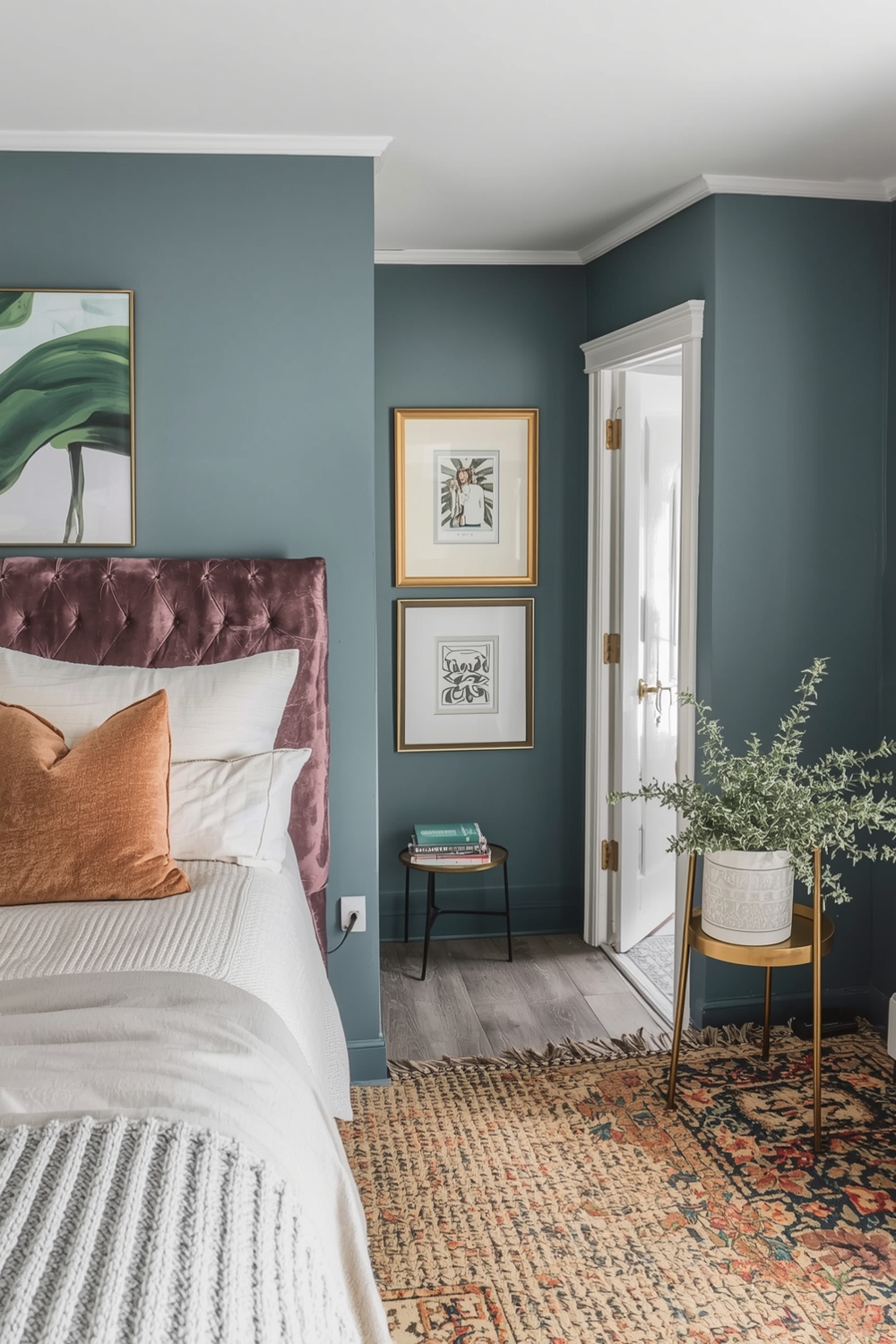
Bedroom palettes should promote rest and relaxation. Soothing combinations like soft gray and lavender, pale blue and white, or warm taupe and cream create peaceful retreats. Avoid overly stimulating colors in sleeping spaces, opting instead for calming hues that encourage quality rest.
Consider darker colors for cozy cocoon-like bedrooms, or light, airy shades for bright, refreshing wake-up environments. Your bedroom palette should align with your sleep preferences and create an atmosphere that supports healthy rest patterns and overall wellness.
How This Idea Improves Your Space
A well-chosen Interior Paint Palette dramatically improves your home’s ambiance, functionality, and value. Cohesive color schemes create professional-looking spaces that feel intentionally designed rather than haphazardly decorated. Good paint choices enhance natural light, make rooms appear larger or cozier as desired, and provide the perfect backdrop for your furniture and artwork. Colors influence mood, productivity, and overall well-being, making thoughtful palette selection an investment in your daily quality of life.
Budget-Friendly Tips
Transform your space affordably by painting just one accent wall instead of entire rooms. Purchase high-quality paint that covers well in fewer coats, ultimately saving money. Shop paint sales during holidays, and ask hardware stores about mistinted paint discounts. Consider painting yourself to eliminate labor costs while achieving professional results.
Conclusion
Selecting the perfect Interior Paint Palette doesn’t have to be overwhelming. With these 16 proven combinations, you can confidently choose colors that enhance your home’s beauty and functionality. Remember to test samples, consider lighting, and trust your instincts. The right palette transforms houses into personalized homes that reflect your unique style and support your lifestyle perfectly.
FAQs
What is the 60-30-10 color rule for interior paint palettes?
This design principle suggests using 60% dominant color, 30% secondary color, and 10% accent color to create balanced, professional-looking spaces with proper visual hierarchy.
How do I choose between warm and cool paint tones?
Consider your room’s natural light (warm tones for north-facing, cool for south-facing), desired mood (warm for cozy, cool for calm), and existing furniture colors to guide your decision.
Can I use different paint palettes in different rooms?
Yes, but maintain some connecting element like a shared neutral or complementary accent color to create cohesive flow throughout your home.
What’s the best neutral paint palette for resale value?
Soft grays, warm beiges, and greige (gray-beige blend) appeal to the widest audience and provide versatile backdrops that help potential buyers envision their belongings in the space.
How many paint samples should I test before deciding?
Test at least 2-3 options per color on different walls, observing them during morning, afternoon, and evening light for 2-3 days before making your final selection.