Introduction
Choosing the perfect Interior Paint Palette can transform any space from ordinary to extraordinary. Whether you’re redesigning your living room, bedroom, or entire home, the right color combinations create ambiance, reflect personality, and enhance your interior design. With countless interior wall color ideas available, finding inspiration that matches your style has never been easier. This comprehensive guide explores 15 stunning paint palette ideas that will help you create beautiful, cohesive rooms tailored to your aesthetic preferences.
Interior Paint Palette Ideas
An effective Interior Paint Palette serves as the foundation for your entire design scheme. When selecting colors, consider the room’s natural lighting, size, and intended purpose. Start by identifying a dominant color, then add complementary accent shades to create depth and visual interest.
Popular palette approaches include monochromatic schemes using varying shades of one color, analogous combinations featuring colors adjacent on the color wheel, or complementary pairings that create striking contrast. Test paint samples on your walls at different times of day to observe how natural and artificial lighting affects the appearance of your chosen colors before committing to the final selection.
Modern Room Paint Colors
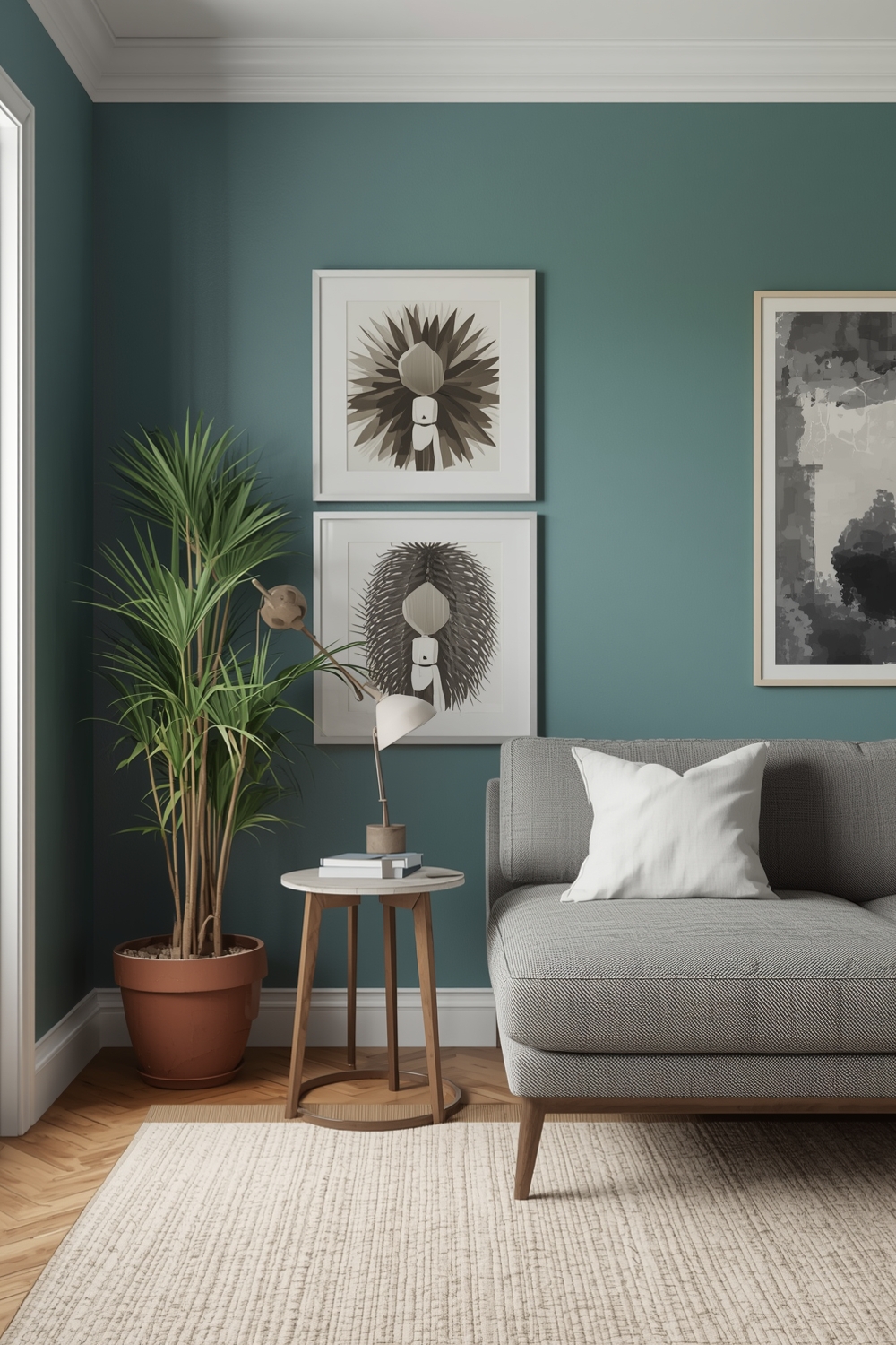
Modern Interior Paint Palette choices embrace clean lines and sophisticated simplicity. Think crisp whites paired with charcoal gray, or soft beige contrasted with deep navy. These contemporary color combinations create sleek, uncluttered spaces that feel both current and timeless.
Incorporate metallic accents like brushed gold or matte black fixtures to elevate your modern paint scheme. Consider using one bold accent wall in a rich jewel tone while keeping remaining walls neutral to maintain that clean, contemporary aesthetic without overwhelming the space.
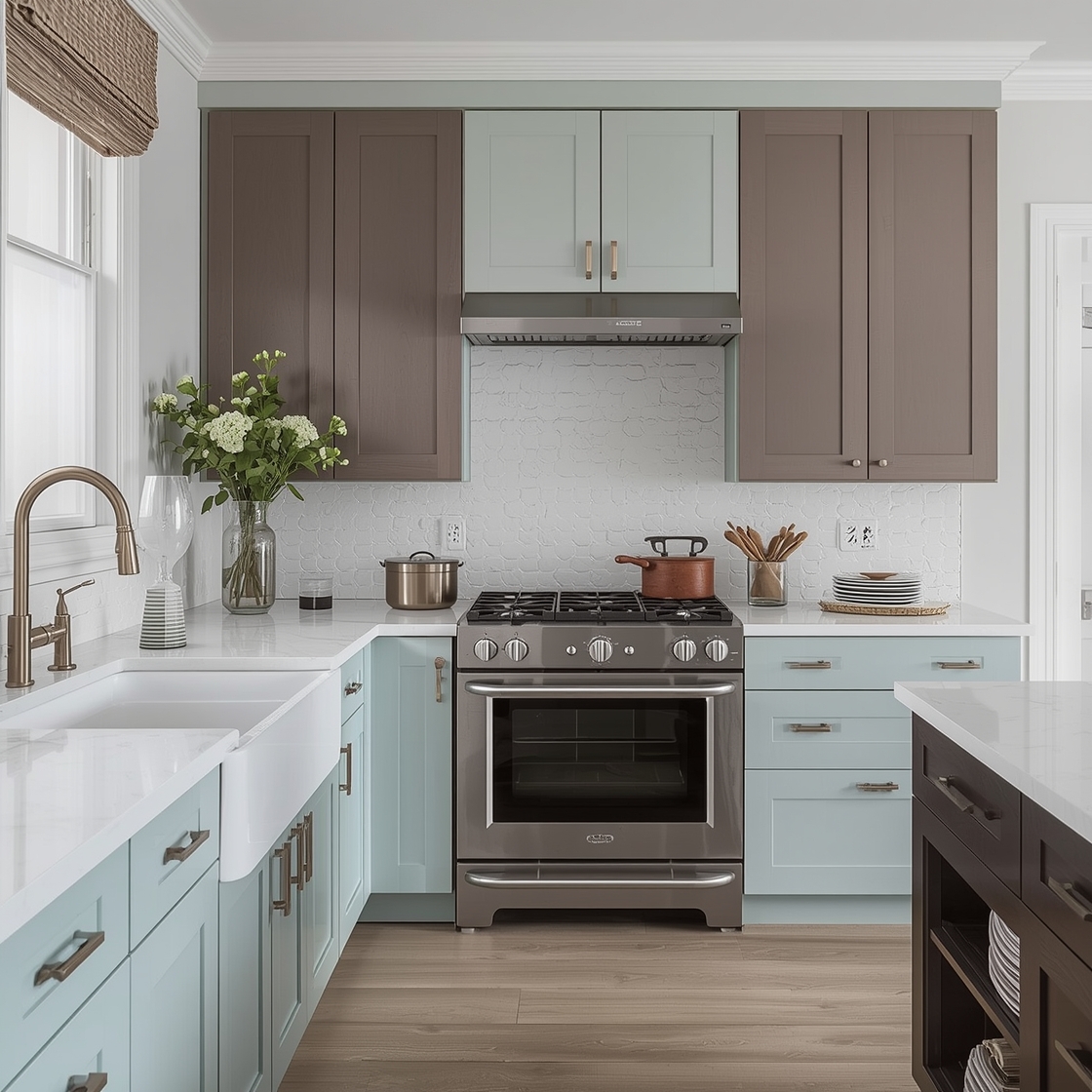
Neutral Room Paint Palettes
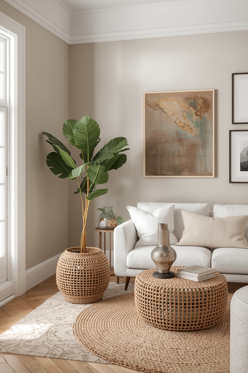
Neutral palettes remain eternally popular for their versatility and calming effect. Shades of white, cream, beige, taupe, and gray form the backbone of these timeless schemes. A well-executed neutral Interior Paint Palette creates a serene backdrop that allows furniture and artwork to shine.
Layer different neutral tones to add dimension—pair warm beiges with cool grays, or combine ivory with soft taupe. This approach prevents neutral rooms from feeling flat or boring while maintaining their soothing, sophisticated character.
Bright and Stylish Room Colors
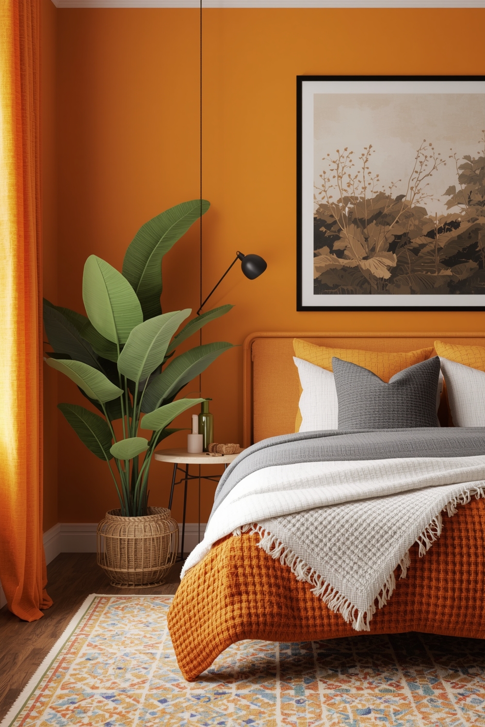
Bold, vibrant colors inject energy and personality into your space. Consider palettes featuring sunny yellows, energetic oranges, or vibrant turquoise. These interior wall color ideas work beautifully in social spaces like kitchens, dining rooms, or playrooms.
Balance bright hues with neutral anchors to prevent visual overwhelm. A brilliant coral accent wall paired with soft white trim and neutral furniture creates impact without feeling chaotic or exhausting to the eyes over time.
Minimalist Interior Paint Ideas
Minimalist design philosophy favors simplicity and restraint. An effective minimalist Interior Paint Palette typically includes just two to three colors, often featuring pristine white, soft gray, and perhaps one subtle accent shade like pale blush or sage green.
The key to successful minimalist color schemes lies in quality over quantity. Focus on perfect paint application, clean edges, and allowing the simplicity of the palette to create a peaceful, uncluttered atmosphere. These schemes work exceptionally well in small spaces, making rooms feel larger and more open.
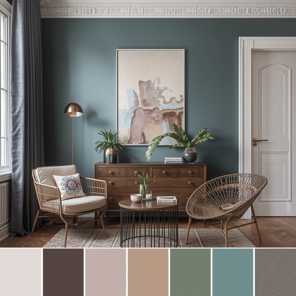
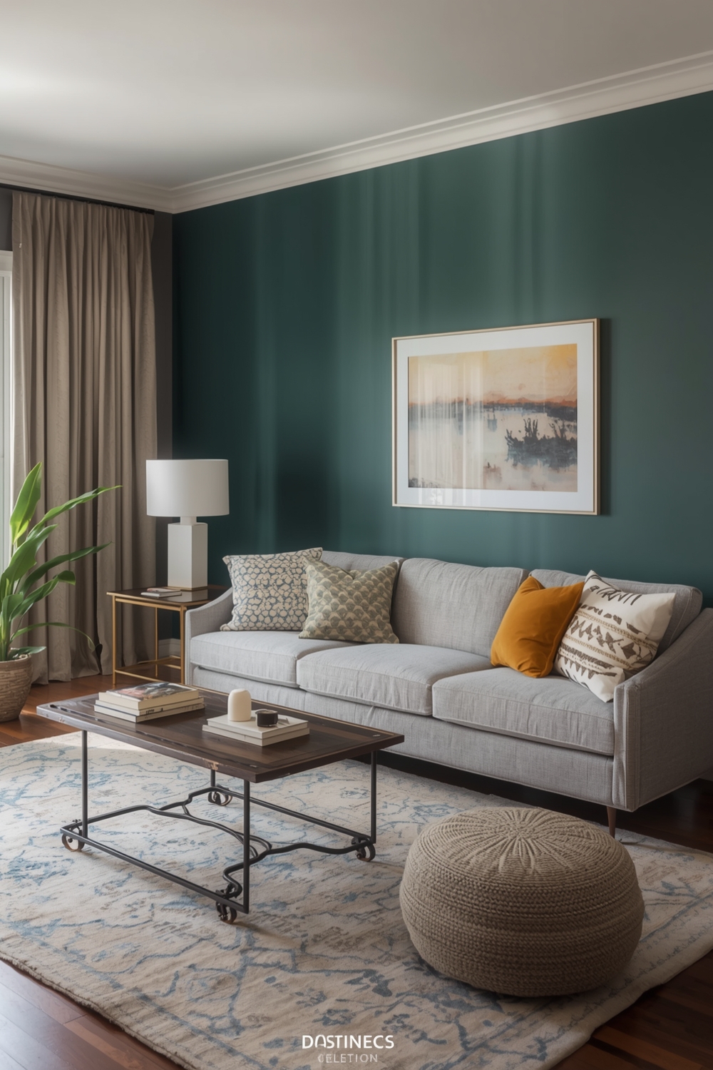
Elegant Room Color Combinations
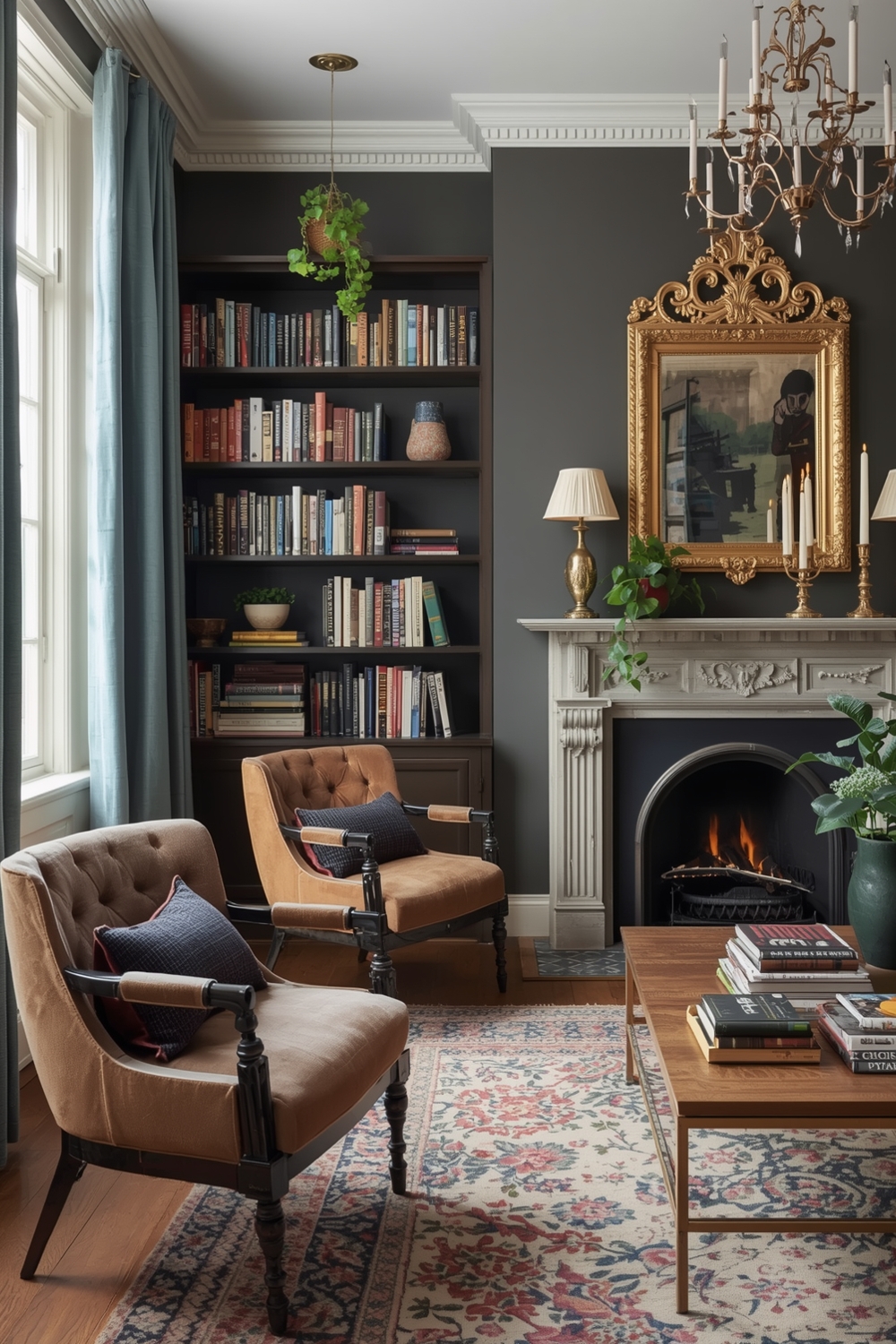
Elegant palettes exude sophistication through carefully curated color pairings. Classic combinations like navy and gold, emerald and cream, or charcoal and blush pink create refined, luxurious atmospheres. These interior wall color ideas suit formal living rooms, master bedrooms, and dining spaces.
Add depth by incorporating different finishes—matte walls with semi-gloss trim, or use wallpaper on one wall while painting others in complementary solid colors. These subtle variations enhance the elegant aesthetic without compromising the cohesive color story.
Contemporary Paint Palettes
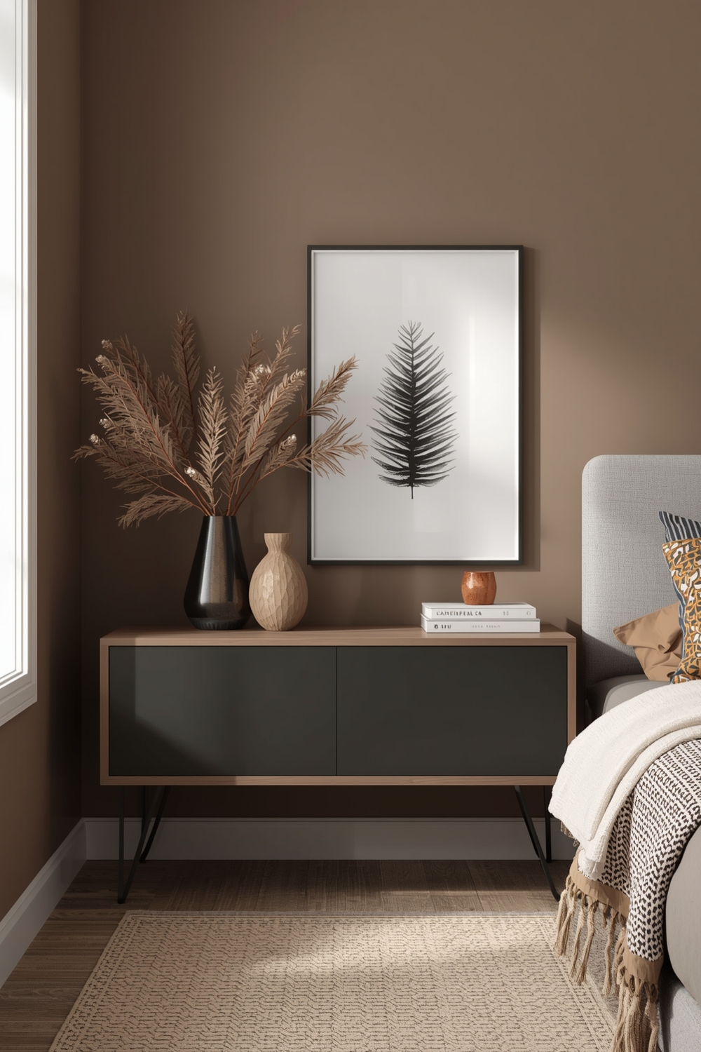
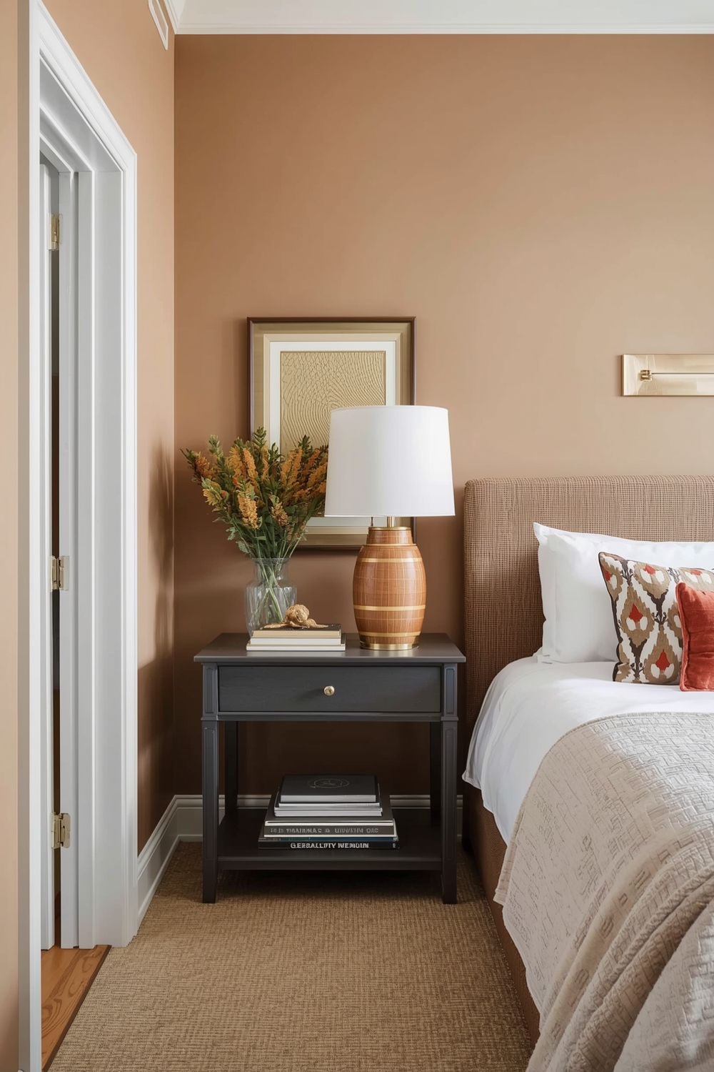
Contemporary design embraces current trends while remaining accessible and livable. Today’s contemporary palettes often feature earthy terracottas, warm terracotta, sage greens, and dusty blues. These colors reflect our connection to nature while maintaining modern sensibility.
Pair these organic hues with natural materials like wood, stone, and linen to reinforce the contemporary aesthetic. The resulting spaces feel both current and comfortable, striking the perfect balance between trendy and timeless.
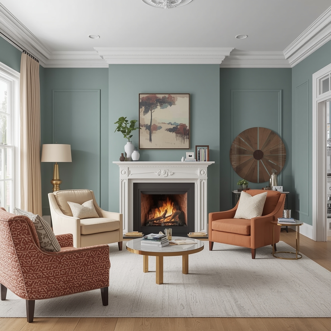
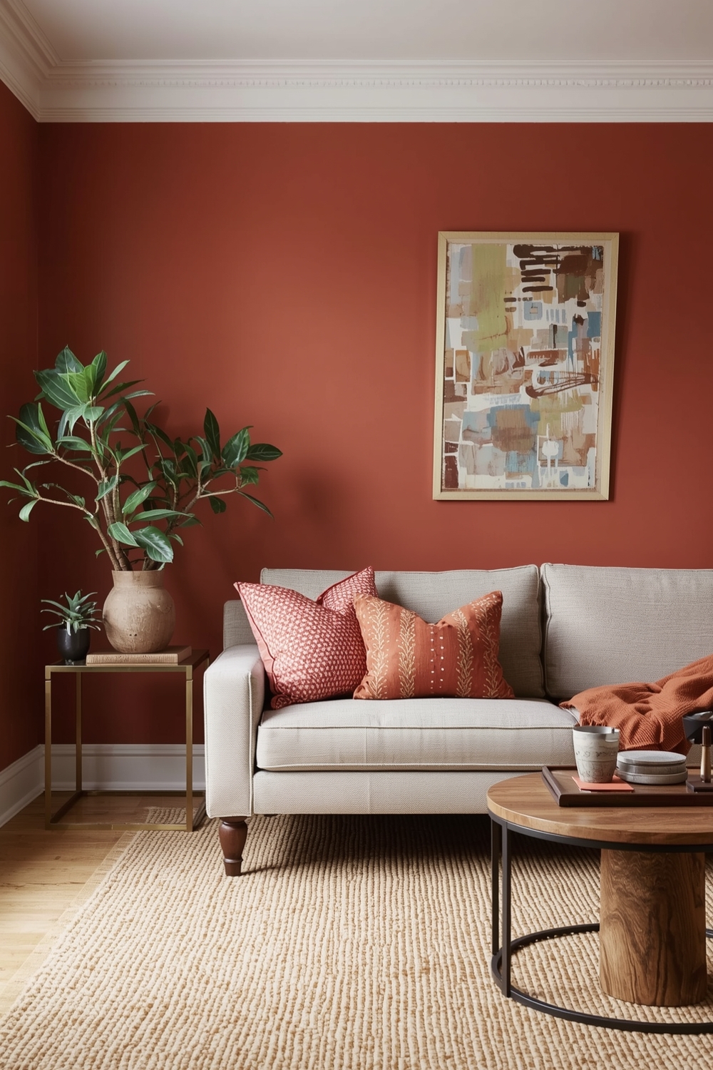
Cozy Room Paint Ideas
Creating a cozy atmosphere depends heavily on warm, inviting colors. Rich caramels, deep burgundies, warm chocolates, and toasted marshmallow whites form the perfect Interior Paint Palette for intimate, comfortable spaces.
These hues work particularly well in bedrooms, reading nooks, and family rooms where comfort takes priority. Layer textiles in complementary shades—throw pillows, blankets, and curtains—to enhance the cozy factor. Proper lighting, especially warm-toned bulbs and layered lighting sources, amplifies the inviting atmosphere these colors naturally create.
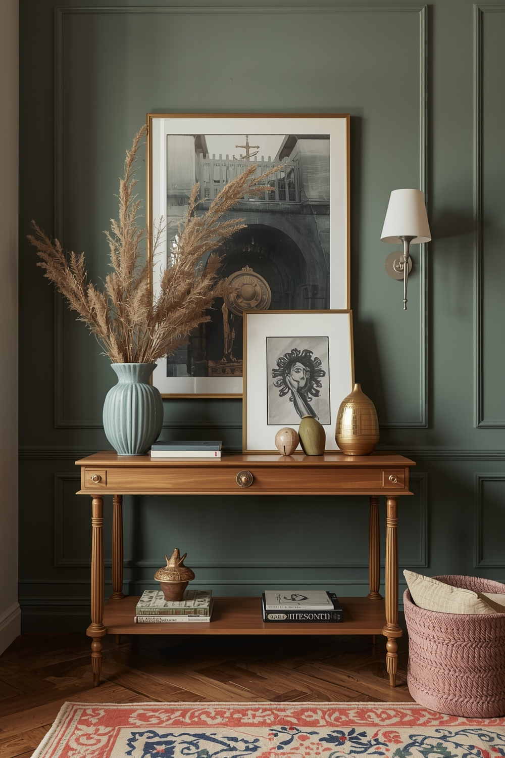
Room Accent Color Ideas
Strategic accent colors add personality and visual interest without overwhelming your space. Choose one wall, architectural feature, or alcove to highlight with a contrasting shade from your main palette. Popular accent choices include deep teal against neutral backgrounds or vibrant mustard yellow in predominantly white rooms.
The 60-30-10 rule provides excellent guidance: 60% dominant color, 30% secondary color, and 10% accent shade. This proportion creates balanced, professional-looking results that feel intentional rather than random.
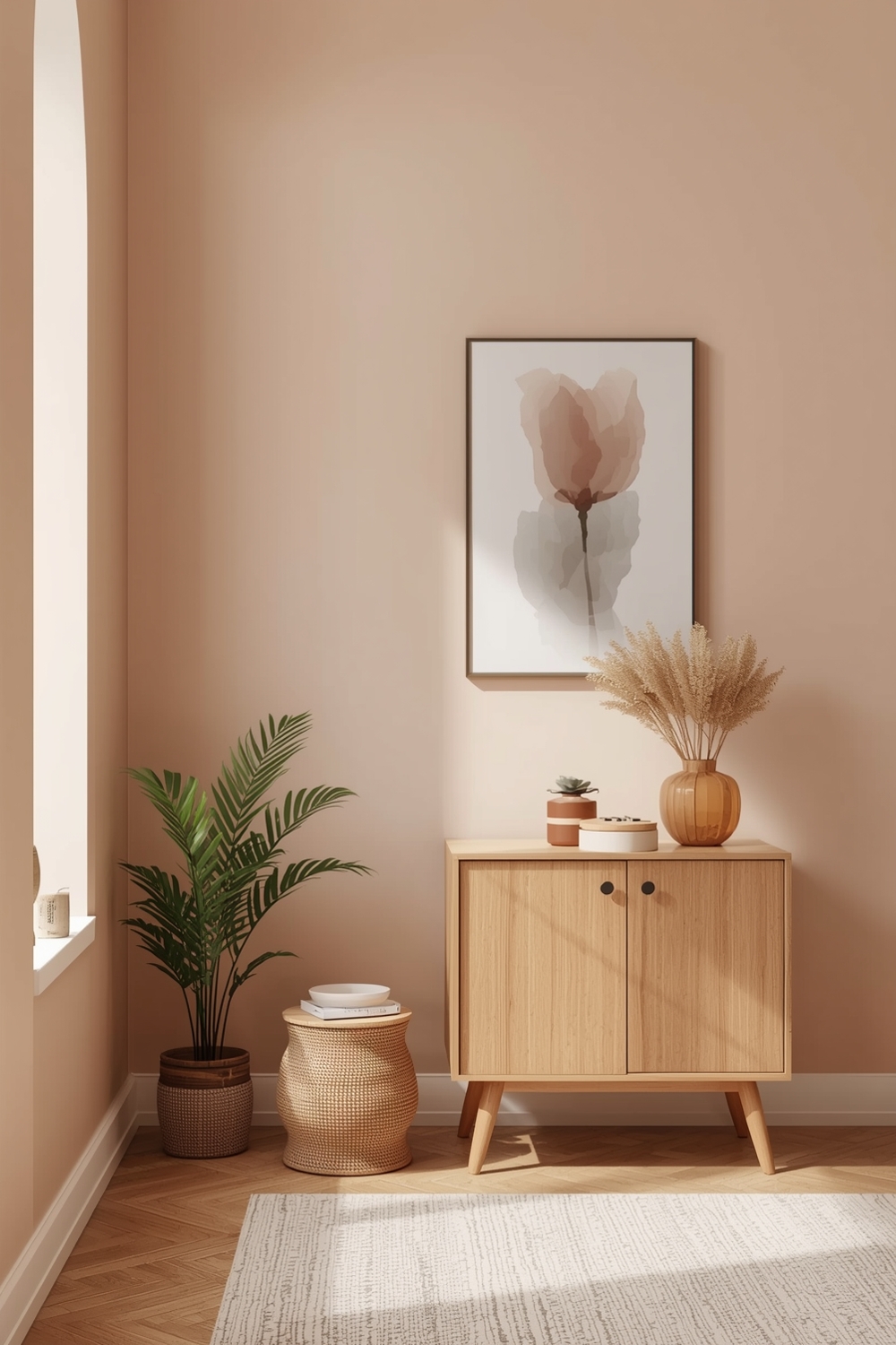
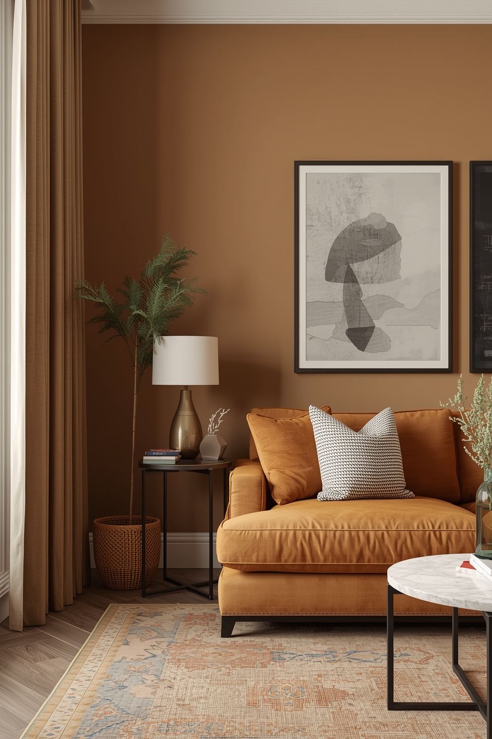
Interior Paint Colors with Warm Tones
Warm color palettes featuring reds, oranges, yellows, and warm neutrals create inviting, energetic environments. These hues make large rooms feel more intimate and naturally complement wood furniture and brass fixtures.
Consider combinations like terracotta and cream, golden yellow and warm gray, or peachy pink and soft white. These interior wall color ideas work beautifully in north-facing rooms that receive limited natural light, as they compensate for coolness with inherent warmth.
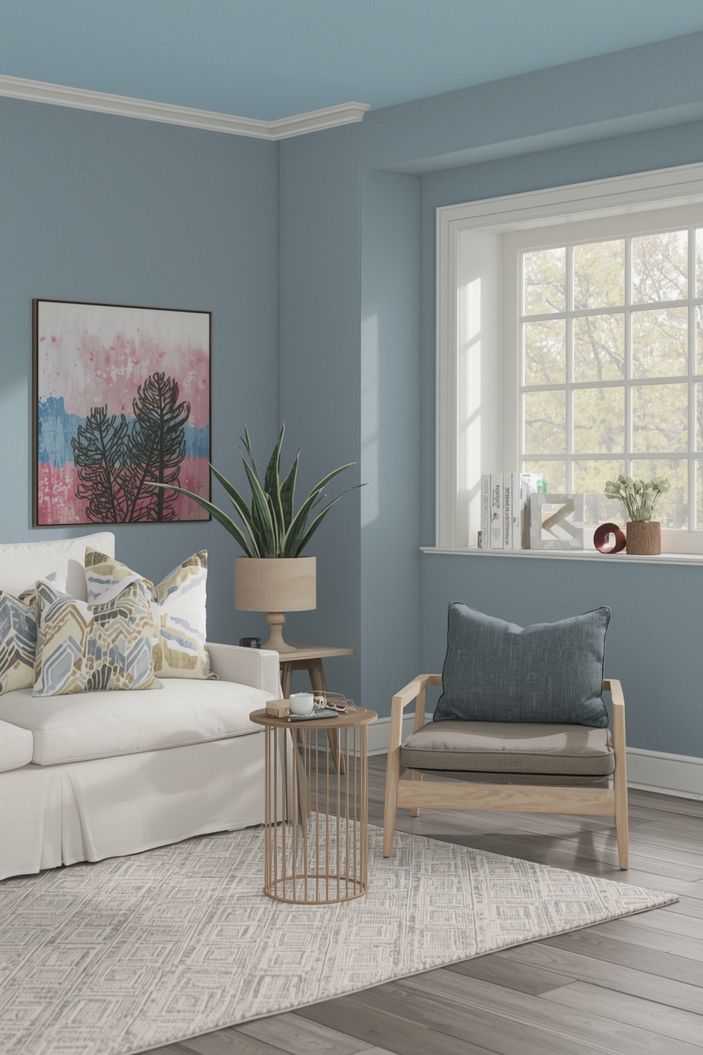
Cool Tone Room Paint Ideas
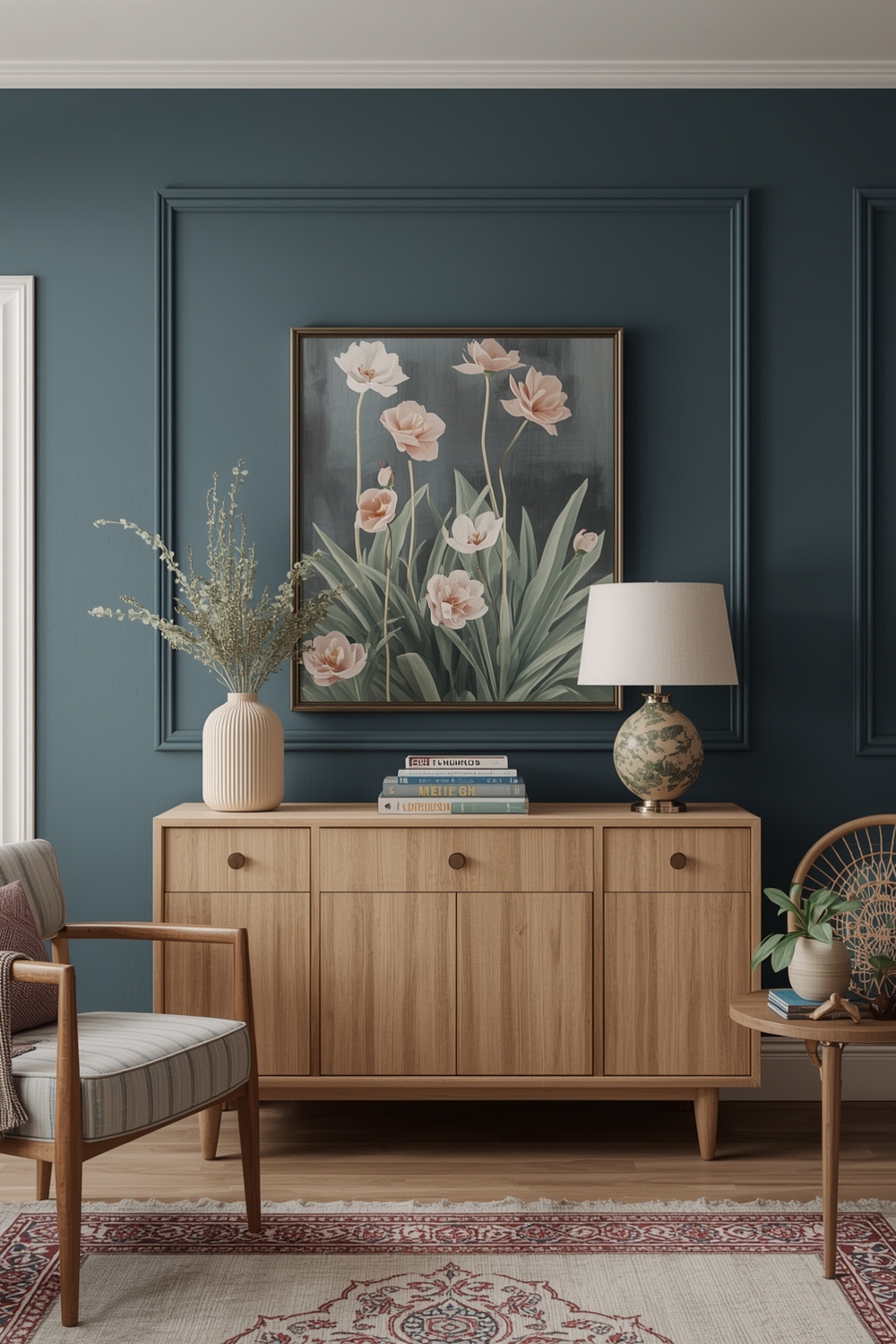
Cool palettes dominated by blues, greens, and purples create calming, refreshing spaces. These colors make small rooms appear larger and naturally suit south-facing spaces with abundant warm sunlight. An effective cool-toned Interior Paint Palette might include soft blue-gray, crisp white, and deeper navy accents.
Pair cool wall colors with warm-toned woods and textiles to prevent spaces from feeling cold or unwelcoming. This balance creates sophisticated rooms that feel both serene and livable, perfect for bedrooms, bathrooms, and home offices where concentration and relaxation matter.
Open Space Paint Palettes
Open-concept living requires thoughtful color planning to define different zones while maintaining visual flow. Use variations of a single color family throughout the space, slightly adjusting the shade for different functional areas. This approach creates subtle definition without harsh visual breaks.
Alternatively, use a consistent neutral base on main walls while introducing different accent colors in specific zones—perhaps blue accents in the living area and green tones in the dining space. This strategy provides definition while preserving the open, airy feeling that makes these layouts desirable.
Functional Interior Color Combinations
Functional spaces like home offices, mudrooms, and laundry rooms deserve thoughtful color treatment too. Choose palettes that enhance productivity and mood—soft greens and blues promote focus, while energizing yellows combat dreariness in utility spaces.
Practical considerations matter here: washable paint finishes, stain-concealing colors, and durable application techniques ensure your interior wall color ideas remain beautiful despite heavy use. Semi-gloss or satin finishes withstand cleaning better than flat paints in high-traffic areas.
Stylish Living Room Paint Ideas
Living rooms benefit from versatile palettes that accommodate various activities and moods. Popular combinations include warm gray walls with white trim and navy accents, or soft sage green paired with cream and natural wood tones.
Consider your furniture and existing décor when selecting your living room palette. The paint should complement rather than compete with statement pieces. Flexible neutral bases allow you to refresh the room’s personality simply by changing accent pillows and accessories.
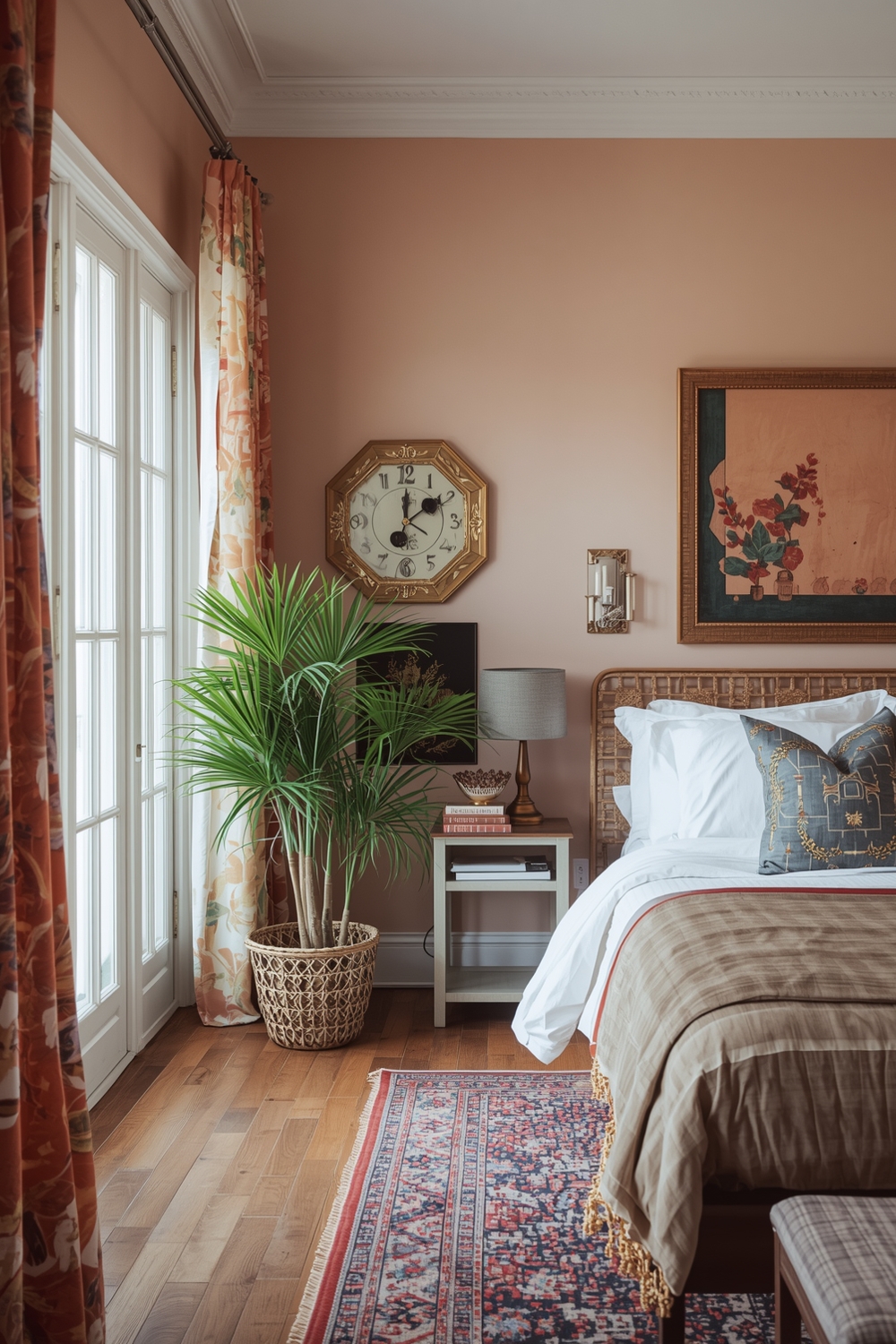
Bedroom Paint Color Inspiration
Bedrooms require calming colors that promote relaxation and restful sleep. Soft blues, gentle lavenders, muted greens, and warm neutrals create the perfect sanctuary atmosphere. Your bedroom Interior Paint Palette should feel personally meaningful while supporting the room’s primary function—quality rest.
Avoid overly stimulating bright colors in sleeping spaces, though you might incorporate them sparingly as small accents. Consider painting the ceiling a shade lighter than the walls to add dimension, or use deeper tones on a single accent wall behind the headboard for dramatic effect without overwhelming the peaceful atmosphere.
How This Idea Improves Your Space
Thoughtfully selected paint palettes transform rooms by influencing perceived size, mood, and functionality. Strategic color choices make small spaces feel expansive, low-ceiling rooms appear taller, and cold rooms seem warmer. Beyond aesthetics, the right colors positively impact mood, productivity, and overall well-being. A cohesive palette throughout your home creates visual harmony that feels intentional and professionally designed, ultimately increasing your home’s appeal and value.
Budget-Friendly Tips
Maximize impact while minimizing costs by painting just one accent wall rather than entire rooms. Purchase paint during seasonal sales, and consider quality mid-range brands that offer excellent coverage at reasonable prices. DIY preparation and application saves significantly compared to professional services, though invest time in proper technique for professional-looking results.
Conclusion
Selecting the perfect Interior Paint Palette empowers you to create beautiful, personalized spaces that reflect your style and enhance daily living. From modern minimalism to cozy warmth, these 15 palette ideas provide inspiration for every aesthetic preference and room type. Start your transformation today by exploring these interior wall color ideas and bringing new life to your home.
FAQs
Q: What is the most popular interior paint palette right now?
A: Warm neutrals combined with earthy accents like terracotta, sage green, and warm grays currently dominate interior design trends, offering versatility and timeless appeal.
Q: How many colors should I include in my interior paint palette?
A: Most successful palettes include 3-5 colors: a dominant shade (60%), secondary color (30%), and 1-2 accent colors (10% total) for balanced, cohesive results.
Q: Can I use different paint palettes in different rooms?
A: Yes, but maintain some connecting elements—shared accent colors or complementary undertones—to ensure visual flow throughout your home.
Q: What colors make small rooms look bigger?
A: Light, cool colors like soft blues, pale grays, and whites reflect light and create the illusion of expanded space in smaller rooms.
Q: How do I choose between warm and cool paint palettes?
A: Consider your room’s natural lighting and orientation: north-facing rooms benefit from warm tones, while south-facing spaces handle cool colors beautifully.