Introduction
Choosing the right Color Harmony Palettes can transform any room from ordinary to extraordinary. Whether you’re redecorating your living room, bedroom, or entire home, understanding how colors work together is essential for creating spaces that feel balanced and inviting. The best color palette combinations not only enhance visual appeal but also influence mood and atmosphere. In this guide, we’ll explore 15 stunning color harmony palettes that will inspire your next design project and help you create beautifully coordinated spaces.
Color Harmony Palettes Combinations
Color Harmony Palettes are carefully curated combinations of colors that work together to create visual balance and aesthetic appeal. These palettes follow color theory principles, ensuring that hues complement rather than clash with each other. Understanding the fundamentals of color harmony helps you select color palette combinations that suit your style and space requirements.
The most effective palettes typically include a dominant color, supporting shades, and accent hues that tie everything together. Whether you prefer bold contrasts or subtle gradients, there’s a harmony palette perfect for every design preference and room function.
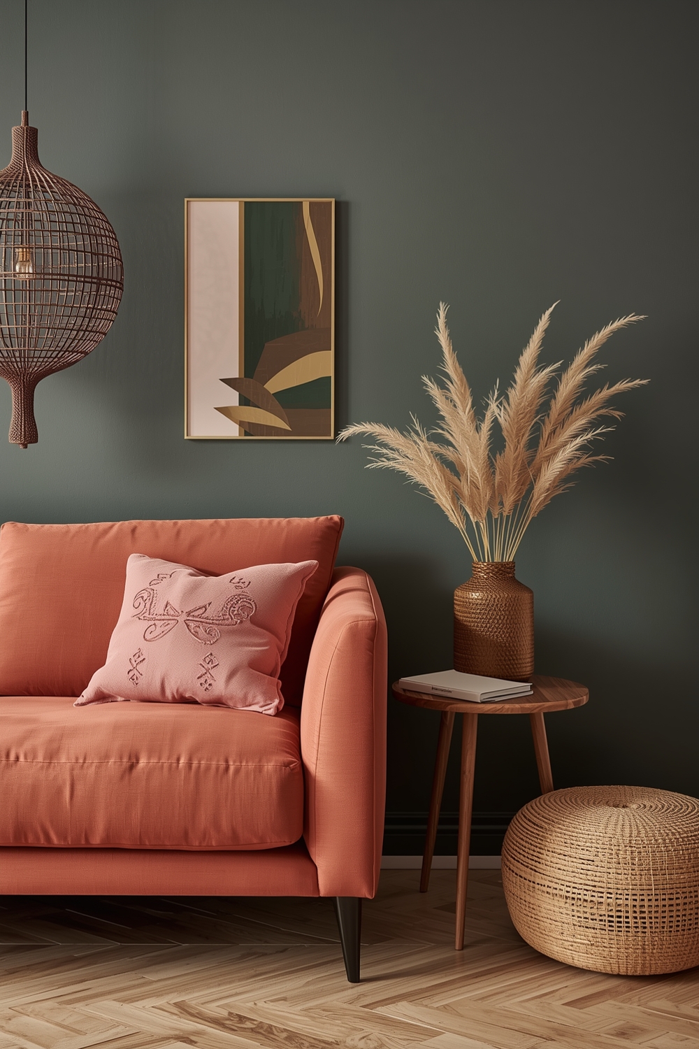
Modern Color Harmony Combinations
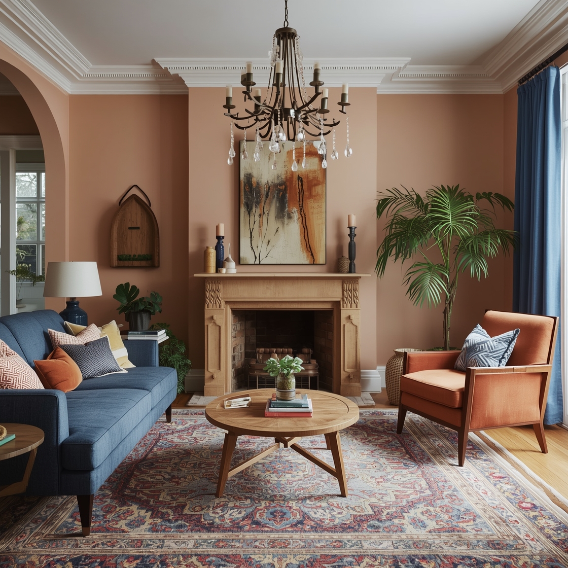
Modern Color Harmony Palettes embrace clean lines, simplicity, and sophisticated color relationships. Think navy blue paired with warm terracotta and soft cream, or charcoal gray combined with blush pink and gold accents. These contemporary combinations reflect current design trends while maintaining timeless appeal.
Modern palettes often incorporate unexpected pairings that challenge traditional color rules. By mixing warm and cool tones strategically, you can create dynamic spaces that feel fresh and current. These color palette combinations work exceptionally well in open-concept homes where visual flow between spaces is essential.
Interior Color Pairing Ideas
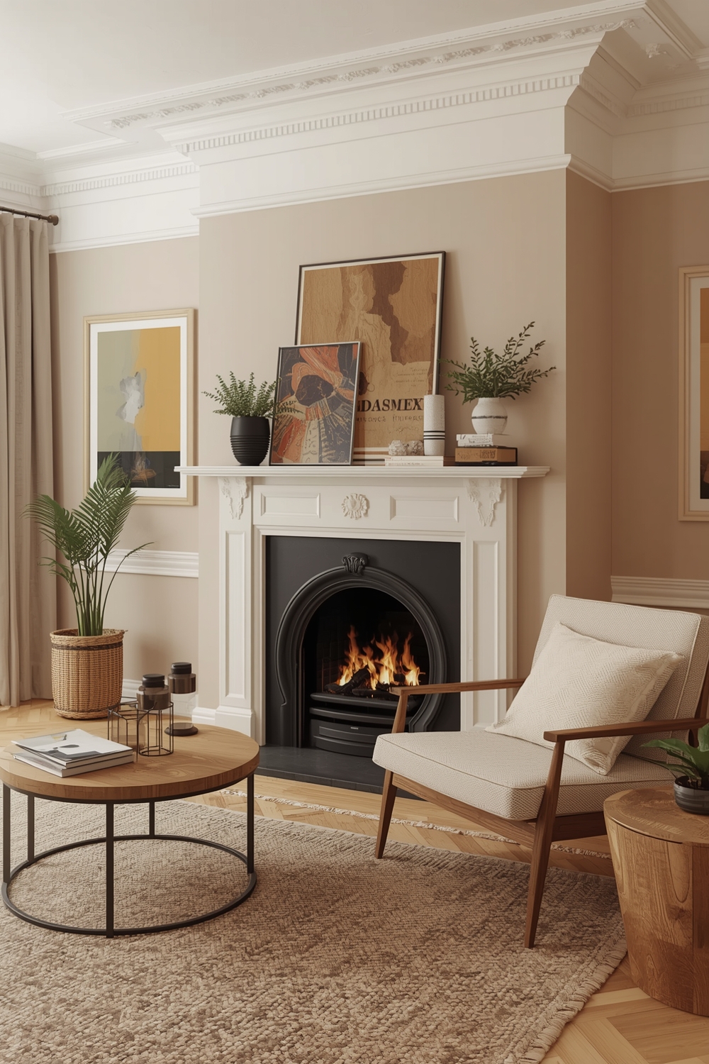
Interior design success relies heavily on thoughtful color pairing. Classic combinations like sage green with warm wood tones, or dusty blue with crisp white, create harmonious environments that stand the test of time. When selecting your Color Harmony Palettes, consider the natural light in your space and how different colors will appear throughout the day.
Successful interior color pairing balances bold statements with neutral foundations, allowing you to change accessories and accents without requiring major overhauls.
Stylish Room Color Combinations

Stylish rooms begin with well-planned Color Harmony Palettes that reflect personality while maintaining sophistication. Consider emerald green with brass and black for a luxurious aesthetic, or soft lavender with gray and white for a serene retreat. These color palette combinations add character without overwhelming the senses.
The key to stylish color combinations is restraint—select three to four main colors and use them consistently throughout your space for cohesive design.
Neutral and Bright Color Ideas
Balancing neutral bases with bright accents creates versatile Color Harmony Palettes that adapt to changing seasons and trends. Start with warm grays, beiges, or soft whites as your foundation, then introduce vibrant pops of coral, turquoise, or sunny yellow through accessories and artwork. This approach allows for easy updates without major renovations.
Neutral and bright combinations offer flexibility while maintaining visual interest. The neutral backdrop prevents bright colors from becoming overwhelming, creating spaces that feel energized yet comfortable. These color palette combinations work beautifully in family spaces where different preferences need to coexist harmoniously.
Functional Color Harmony Layouts

Functional Color Harmony Palettes consider both aesthetics and practicality. For high-traffic areas, durable darker tones paired with lighter accents hide wear while maintaining brightness. In home offices, blues and greens promote focus and productivity, while warm tones in dining areas stimulate appetite and conversation.
These practical color palette combinations enhance how spaces perform their intended functions while looking beautiful.
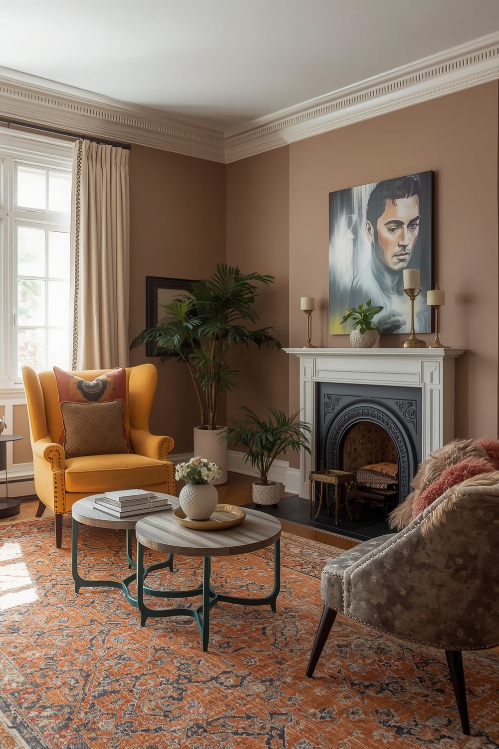
Elegant Room Color Pairings
Elegance emerges from refined Color Harmony Palettes featuring sophisticated hues like deep burgundy with cream and gold, or slate blue with silver and white. These timeless combinations exude luxury and refinement without requiring expensive furnishings. Elegant color pairings rely on balance—pairing rich, deep colors with lighter neutrals prevents spaces from feeling heavy.
Metallic accents in gold, silver, or bronze elevate these color palette combinations to new levels of sophistication.
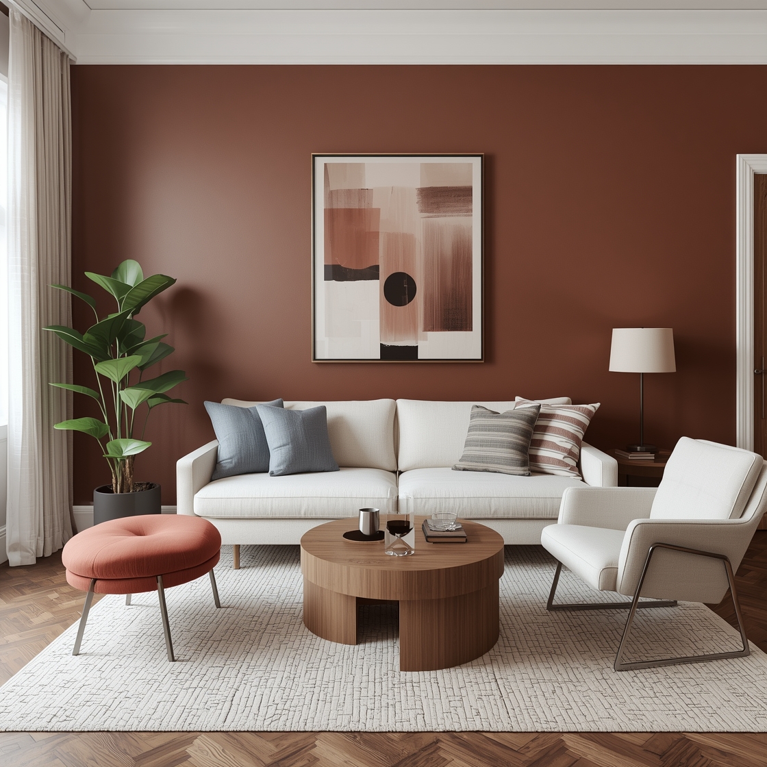
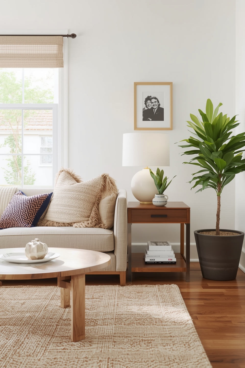
Minimalist Room Color Combinations
Minimalist design thrives on restrained Color Harmony Palettes that emphasize simplicity and clarity. Monochromatic schemes using various shades of one color create serene, uncluttered spaces. White paired with light gray and single wood tone exemplifies minimalist perfection. These stripped-down palettes highlight architectural features and quality materials rather than competing for attention.
The beauty of minimalist color palette combinations lies in their ability to create calm, focused environments that support modern lifestyles. By limiting your palette to two or three colors, you achieve visual harmony that feels both intentional and effortless.
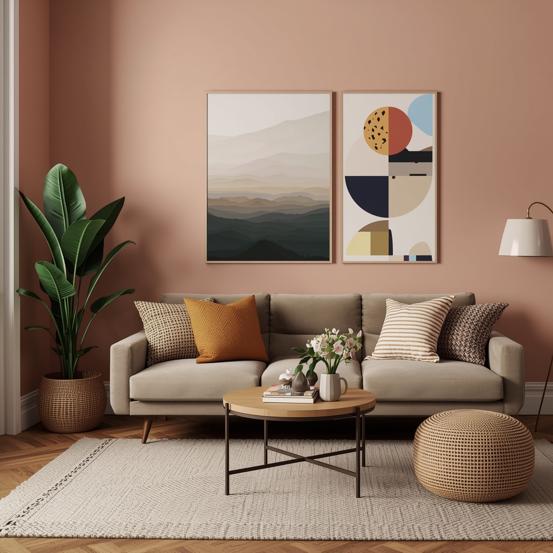
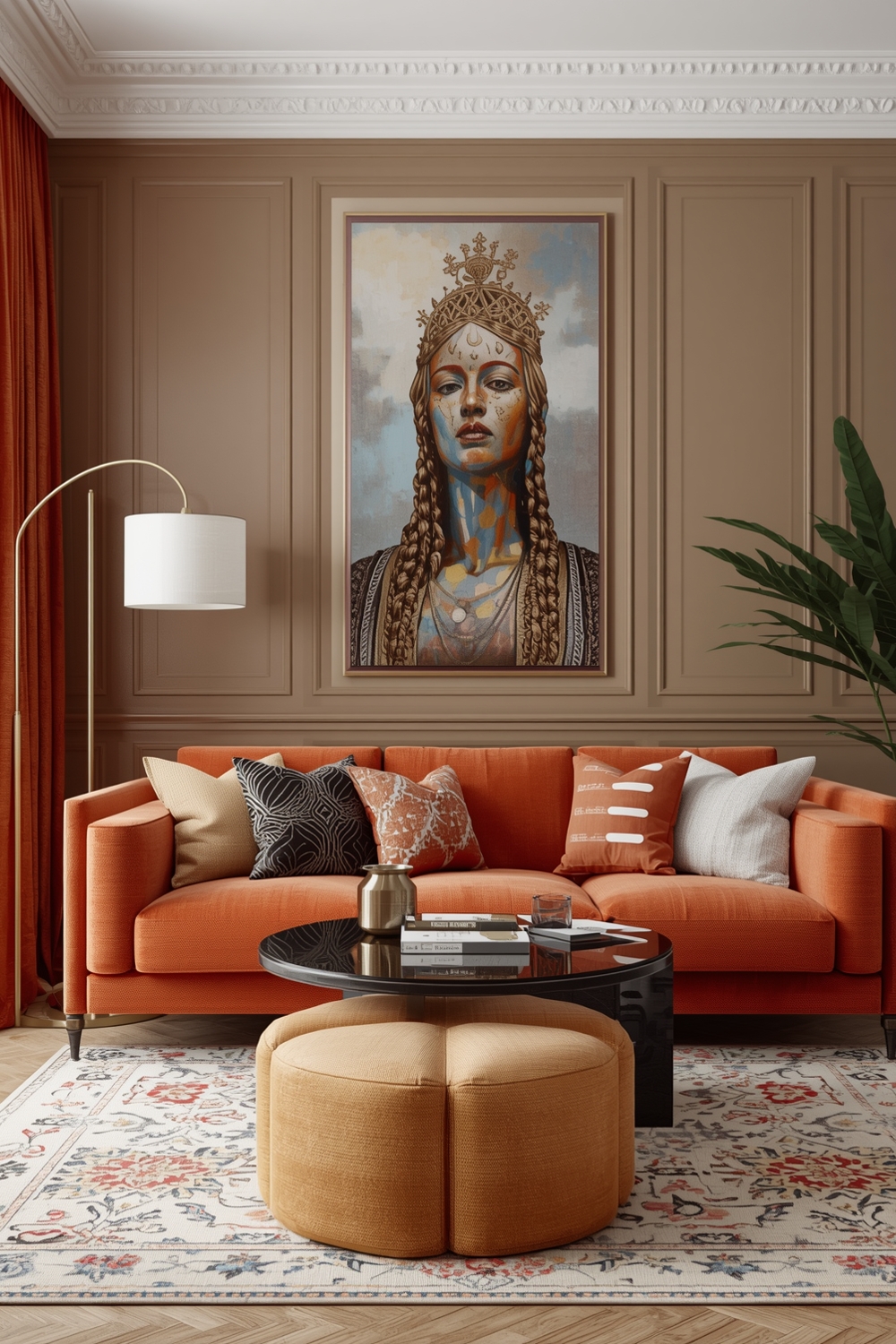
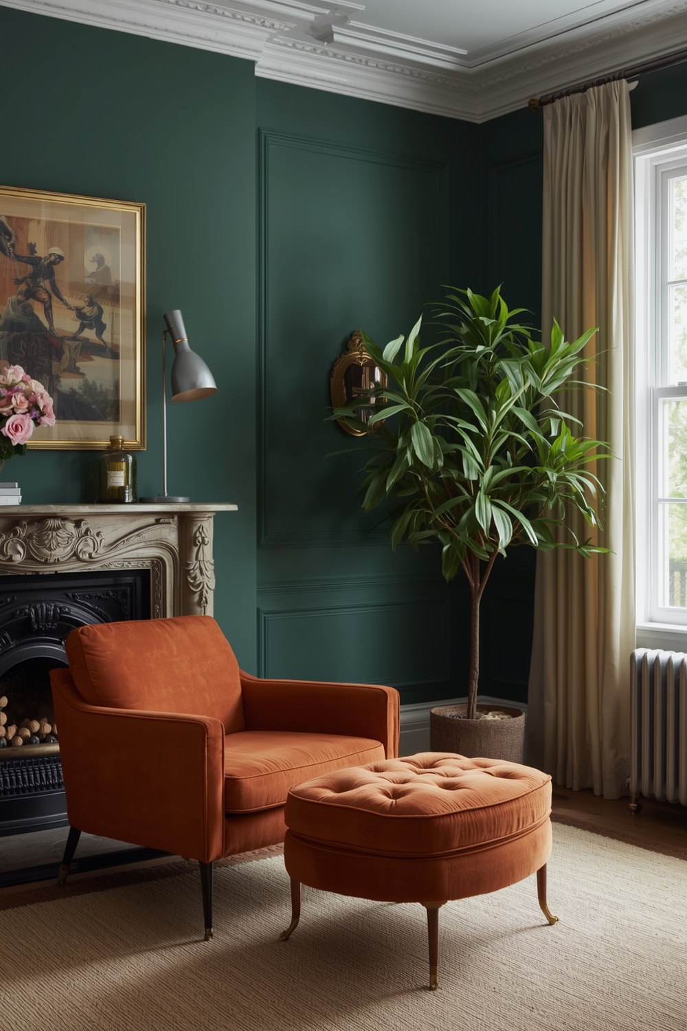
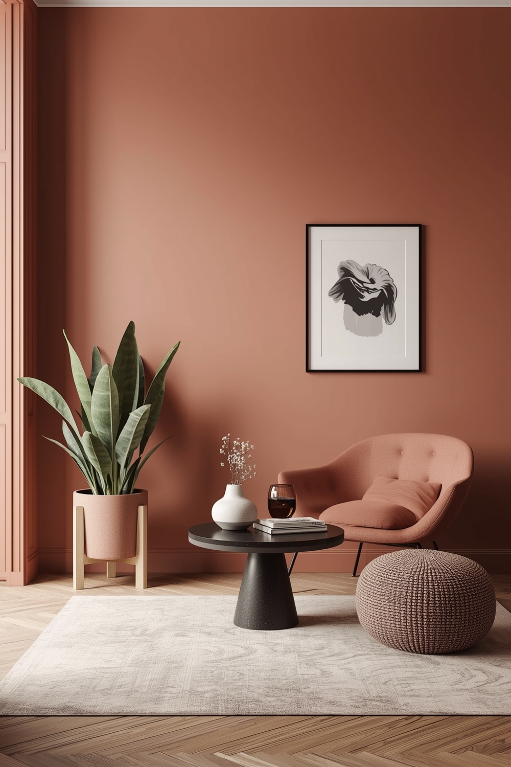
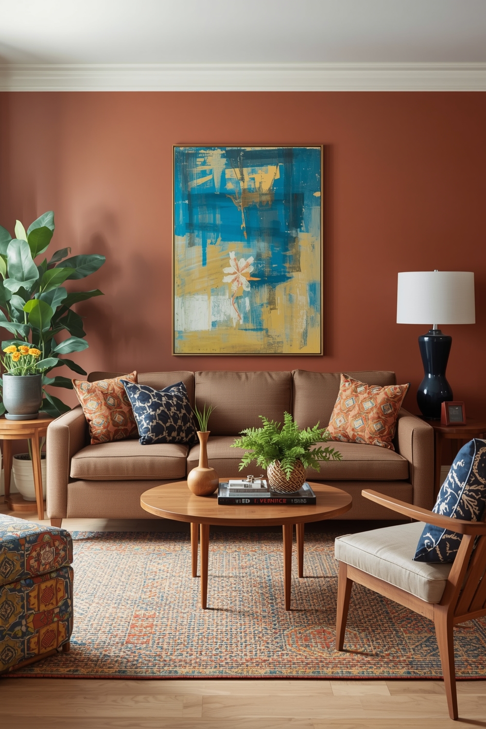
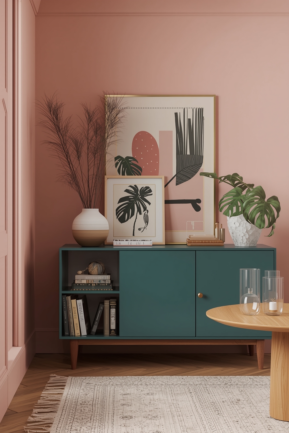
Contemporary Color Harmony Palettes
Contemporary color palette combinations blend current trends with livable design. Popular contemporary palettes include warm terracottas with deep greens and cream, or muted pinks with charcoal and brass accents. These combinations feel current without being trendy, ensuring your space remains stylish for years to come.
Contemporary Color Harmony Palettes often incorporate natural, earthy tones that connect interior spaces with the outdoors.
Room Color Balance Ideas
Achieving color balance requires understanding proportions within your Color Harmony Palettes. The 60-30-10 rule provides excellent guidance: use your dominant color for 60% of the space, secondary color for 30%, and accent color for 10%. This formula ensures visual harmony while preventing any single color from overwhelming the room.
Balanced color palette combinations create comfortable spaces where the eye moves naturally without jarring interruptions or dead spots.
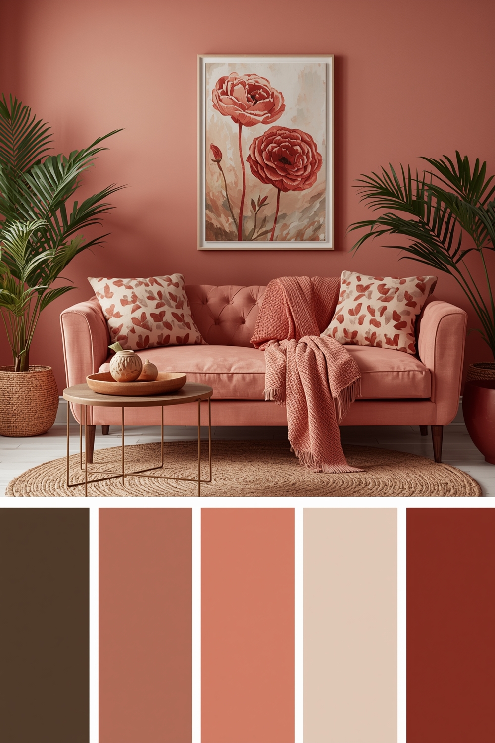
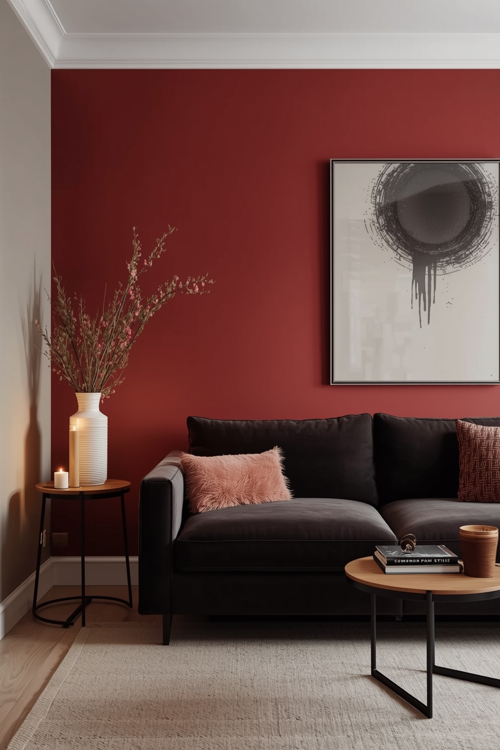
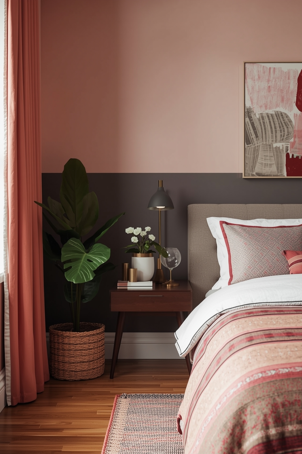
Cozy Color Harmony Layouts
Cozy spaces benefit from warm Color Harmony Palettes featuring rich browns, deep reds, warm oranges, and golden yellows. These inviting combinations make rooms feel intimate and comfortable, perfect for bedrooms, reading nooks, and family gathering spaces. Layering different textures in similar warm tones adds depth without visual clutter.
Consider pairing caramel and chocolate browns with cream and burnt orange for ultimate coziness. These color palette combinations wrap rooms in warmth, making them irresistible retreats from the busy world. Adding soft lighting enhances the cozy atmosphere created by your carefully selected palette.
Accent Color Harmony Ideas
Strategic accent colors transform basic Color Harmony Palettes into dynamic compositions. Choose one bold accent color to complement your neutral foundation—perhaps emerald against gray, or mustard yellow with navy blue. Use accent colors sparingly in pillows, artwork, and decorative objects for maximum impact without overwhelming the space.
Accent color palette combinations offer flexibility to refresh your decor seasonally or as trends evolve. Simply swapping accent colors through accessories updates your entire space without major investment, keeping your home feeling current and personalized.
Color Harmony Ideas for Living Spaces
Living spaces require versatile Color Harmony Palettes that accommodate various activities and moods. Consider warm gray with soft blue and natural wood tones for flexibility, or cream with sage green and terracotta for organic warmth. These combinations work across furniture styles and adapt as your needs change over time.
Living room color palette combinations should feel welcoming to guests while reflecting your family’s personality and lifestyle preferences.
Timeless Color Harmony Combinations
Timeless Color Harmony Palettes transcend trends, remaining beautiful across decades. Classic combinations like navy and white, forest green and cream, or gray and yellow never go out of style. These proven pairings provide safe choices for those investing in permanent finishes like paint, tile, or cabinetry.
By choosing timeless color palette combinations, you protect your investment and ensure your home remains attractive to future buyers if you decide to sell.
Room Color Harmony Inspiration

Finding inspiration for your Color Harmony Palettes can come from unexpected sources—nature, artwork, fashion, or travel experiences. Notice which color combinations consistently attract you, and use those observations to guide your design decisions. Create mood boards with paint samples, fabric swatches, and inspirational images to test how colors work together before committing.
Online resources offer endless color palette combinations to explore, but the most successful palettes reflect your personal taste and complement your home’s unique characteristics. Trust your instincts while applying basic color theory principles for best results.
How This Idea Improves Your Space
Implementing well-planned Color Harmony Palettes dramatically improves how your space looks and feels. Cohesive color schemes create visual flow between rooms, making homes feel larger and more organized. The right color palette combinations enhance natural light, improve mood, and reflect your personality. Colors influence perception of temperature, room size, and even time spent in spaces. By thoughtfully selecting harmonious colors, you create environments that support your lifestyle and wellbeing.
Budget-Friendly Tips
You don’t need expensive renovations to implement beautiful Color Harmony Palettes. Start with paint, the most cost-effective transformation tool available. Add color through affordable accessories like throw pillows, curtains, and artwork. Shop secondhand stores for unique pieces in your chosen color palette combinations, and repaint or reupholster existing furniture rather than buying new items.
Conclusion
Mastering Color Harmony Palettes transforms your approach to interior design, enabling you to create beautiful, cohesive spaces that reflect your style. Whether you prefer modern minimalism, cozy warmth, or elegant sophistication, the right color palette combinations bring your vision to life. Experiment with these 15 palette ideas, trust your instincts, and enjoy the creative process of making your house truly feel like home.
FAQs
What are Color Harmony Palettes?
Color Harmony Palettes are coordinated color combinations based on color theory principles that create visually balanced and aesthetically pleasing spaces. They typically include dominant, supporting, and accent colors that work together harmoniously.
How many colors should be in a color palette?
Most effective color palettes include 3-5 colors: one dominant color (60%), one secondary color (30%), one or two accent colors (10%), and possibly a neutral. This creates balance without overwhelming the space.
What’s the easiest way to choose color palette combinations?
Start with a color you love, then use the color wheel to find complementary or analogous colors. Alternatively, draw inspiration from artwork, nature, or fabrics you already own to build your palette around existing elements.
Can I mix warm and cool colors in one palette?
Yes! Mixing warm and cool tones creates dynamic, interesting spaces. The key is maintaining balance—use one temperature as dominant and the other as accent to prevent the palette from feeling chaotic.
How do I test color combinations before committing?
Create physical mood boards with paint samples, fabric swatches, and photos. Paint large poster boards with your colors and move them around the room at different times of day to see how lighting affects them before painting walls.