Introduction
Choosing the perfect Interior Paint Palette can transform any room from ordinary to extraordinary. The right combination of colors creates ambiance, enhances natural light, and reflects your personal style. Whether you’re renovating your entire home or refreshing a single room, understanding effective interior wall color ideas is essential. This comprehensive guide explores 16 stunning paint palette layouts that will inspire your next design project and help you create spaces that truly feel like home.
Interior Paint Palette Layouts
An effective Interior Paint Palette serves as the foundation for your entire design scheme. These layouts typically include a dominant color, secondary shades, and accent tones that work harmoniously together. When selecting your palette, consider factors like room size, natural lighting, existing furniture, and the mood you want to create.
Popular layout strategies include the 60-30-10 rule, where 60% represents your main color, 30% the secondary shade, and 10% accent colors. This balanced approach ensures visual interest without overwhelming the space. Modern designers also recommend testing paint samples in different lighting conditions throughout the day before committing to your final choices.
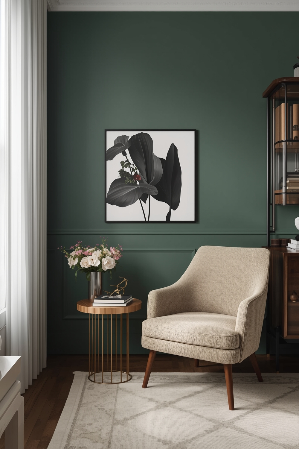
Harmonious Room Paint Ideas
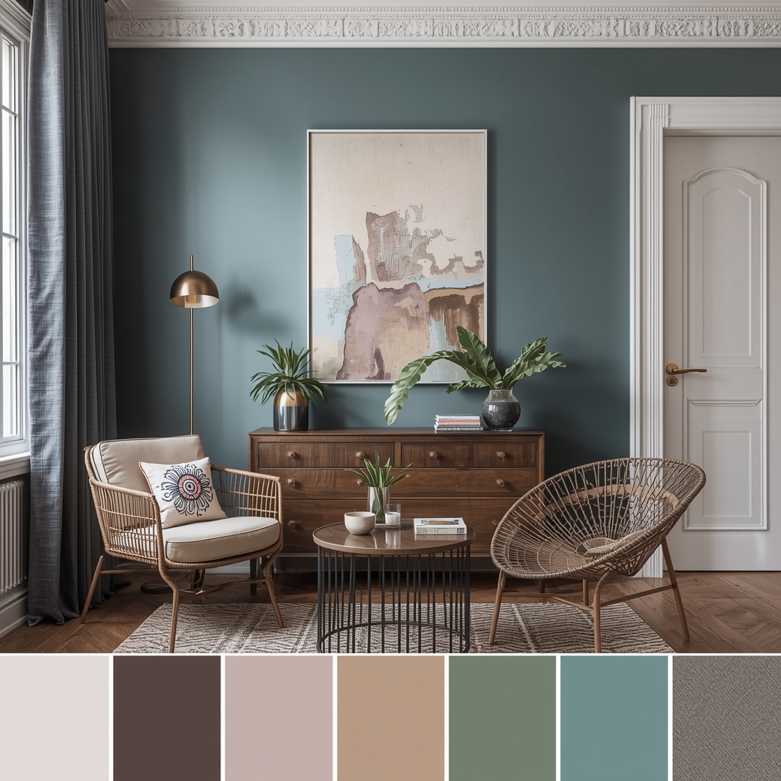
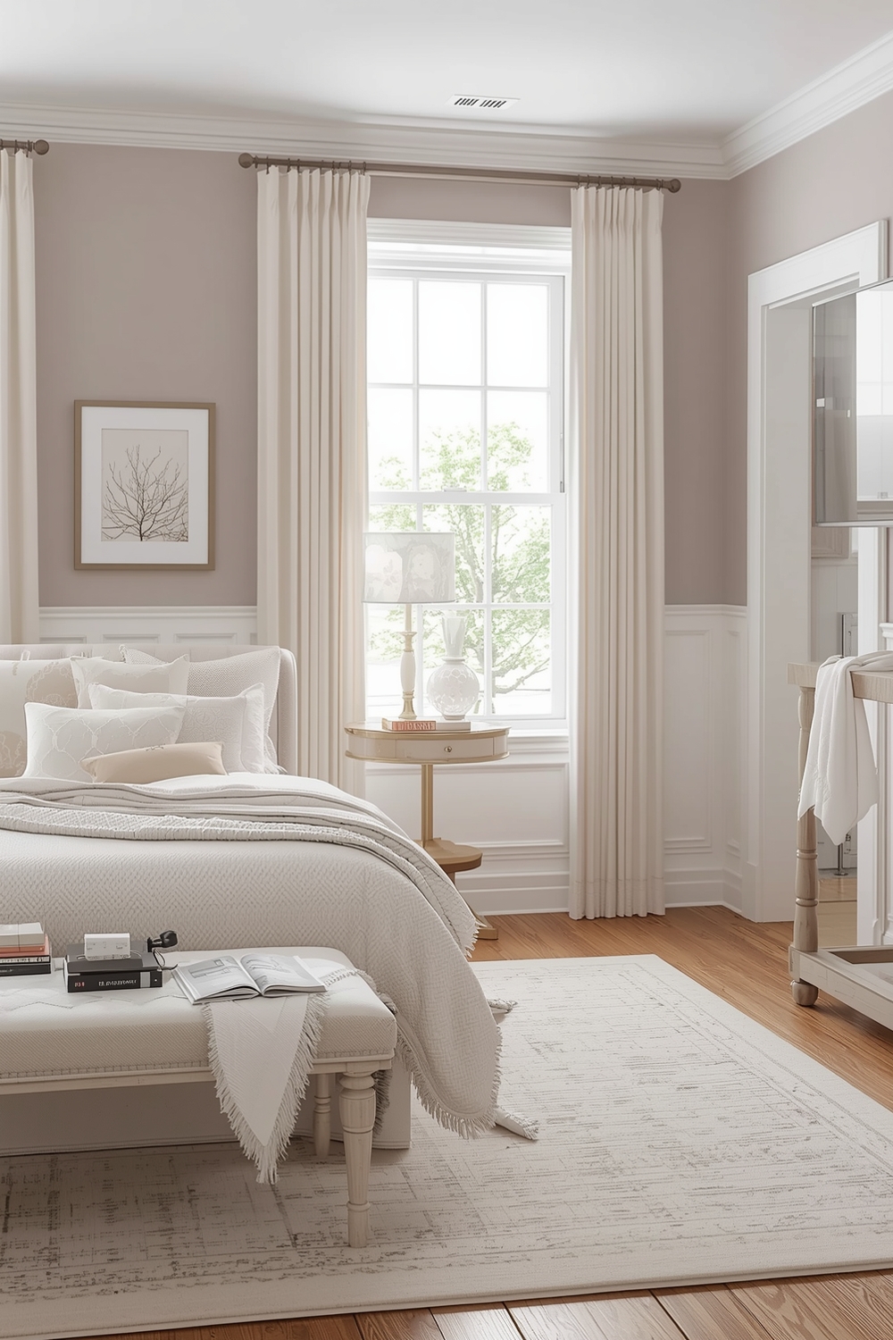
Creating harmony through color requires understanding how different hues interact with each other. Harmonious interior wall color ideas often draw from analogous color schemes—colors that sit next to each other on the color wheel. Think soft blues flowing into gentle greens, or warm terracottas blending with peachy tones.
These combinations create a soothing, cohesive atmosphere perfect for bedrooms and living spaces. Layer different shades of the same color family to add depth while maintaining tranquility. Consider pairing cream walls with taupe trim and beige accents for a sophisticated, timeless look that works in any architectural style.
Interior Paint Combinations for Modern Homes
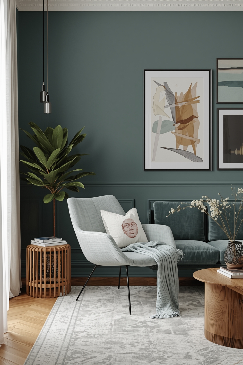
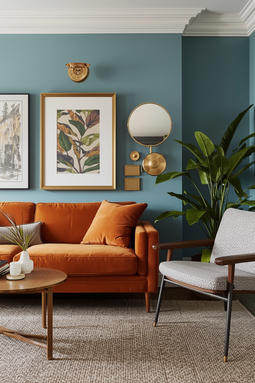
Modern homes benefit from bold, contemporary paint combinations that make strong design statements. An Interior Paint Palette for modern spaces often features clean contrasts like charcoal gray paired with crisp white, or navy blue accented with brass metallic tones.
Monochromatic schemes with varying intensities create sleek, minimalist aesthetics. Consider deep emerald greens, muted sage, and soft mint for a sophisticated layered effect. These contemporary combinations work exceptionally well in open-concept spaces where visual continuity matters most.
Neutral and Bright Room Color Layouts
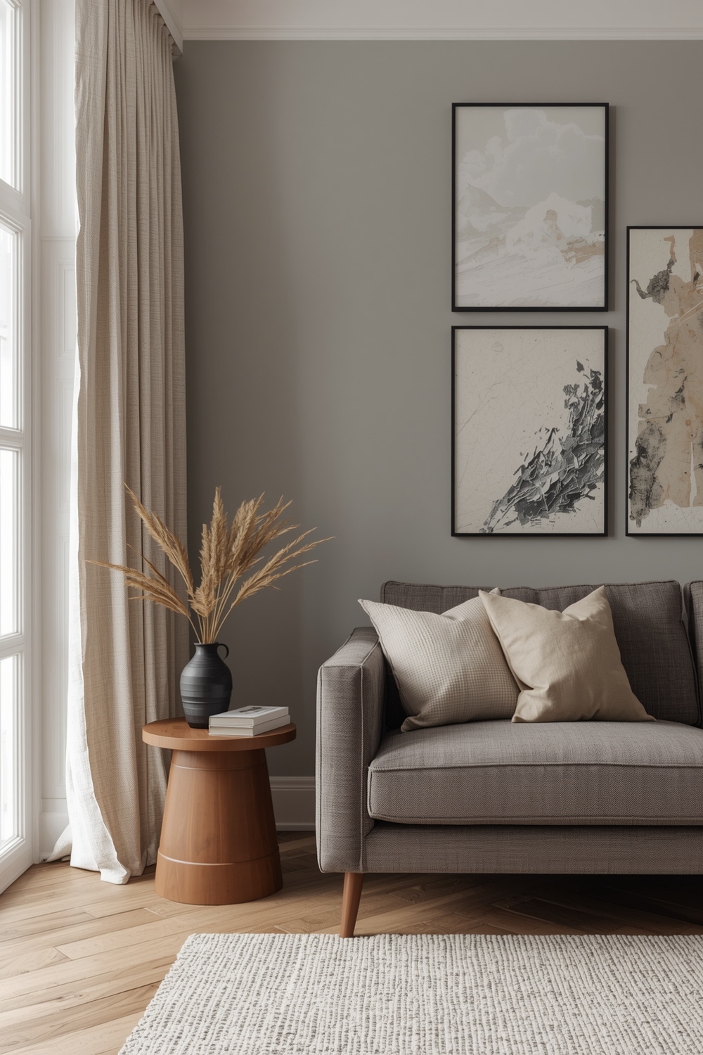
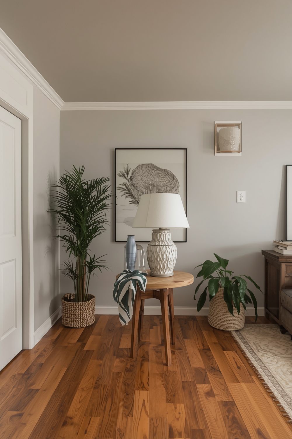
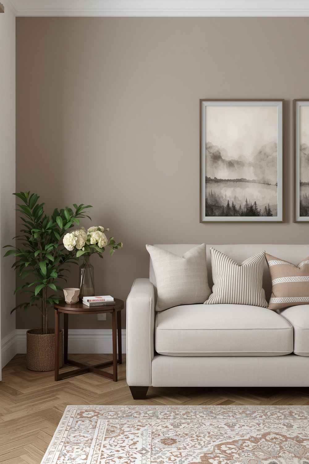
Neutral palettes remain enduringly popular for their versatility and timeless appeal. A neutral Interior Paint Palette might include warm whites, soft grays, beiges, and taupes that create a sophisticated backdrop for any décor style.
To prevent neutral spaces from feeling flat, incorporate varying textures and layer different shades within the same color family. Bright accents through artwork, textiles, and accessories add personality without commitment. This approach allows flexibility as your design preferences evolve over time.
Functional Interior Paint Palettes
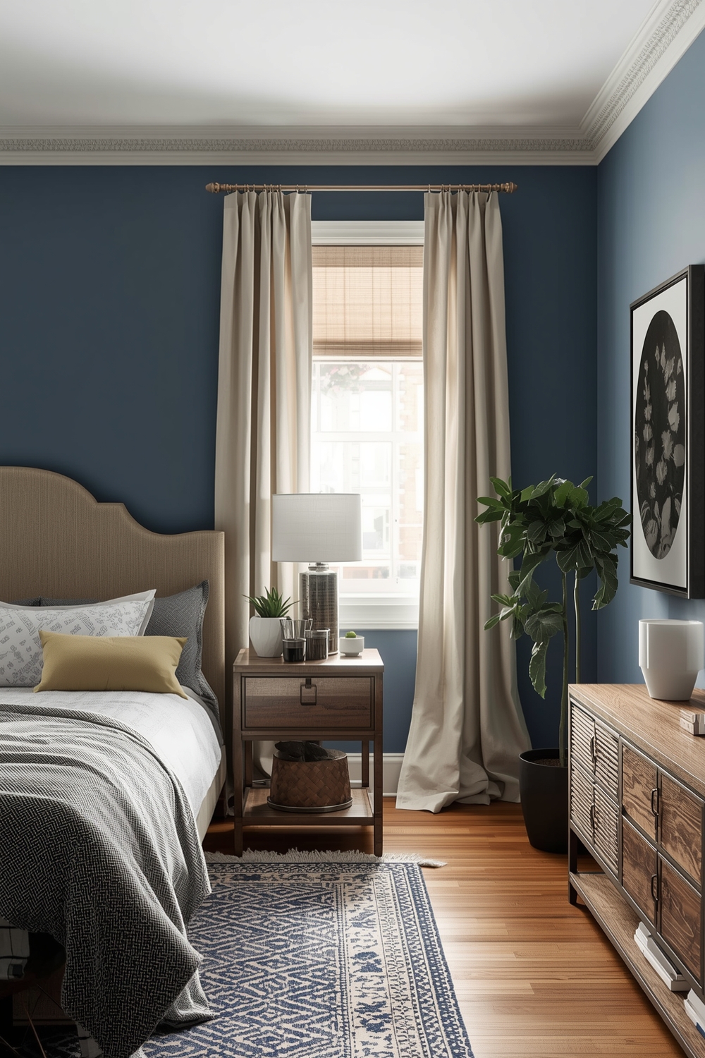
Functional paint palettes consider both aesthetics and practical needs. Different rooms serve different purposes, so your color choices should support those functions. Bedrooms benefit from calming blues and soft lavenders that promote relaxation, while home offices thrive with energizing yellows or focused greens.
Kitchens often work best with clean, bright colors that create a fresh, hygienic feeling. Bathrooms can handle more adventurous choices since they’re smaller spaces. When developing your Interior Paint Palette, think about how each room will be used and select colors that enhance those activities.
Elegant Room Color Layouts
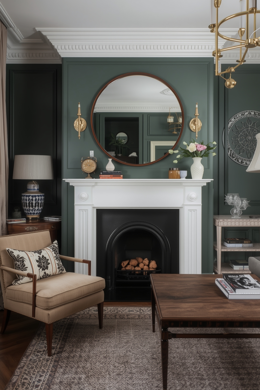
Elegant interior spaces often feature refined color combinations that exude sophistication. Think soft champagne paired with dove gray, or dusty rose complemented by cream and gold accents. These elevated palettes create luxurious atmospheres without overwhelming the senses.
Rich jewel tones like sapphire, emerald, and amethyst add drama when used thoughtfully as accent walls or in smaller spaces. Pair them with neutral backgrounds to maintain balance and prevent visual fatigue in your overall design scheme.
Minimalist Room Paint Combinations
Minimalist design philosophy emphasizes simplicity and restraint. A minimalist Interior Paint Palette typically features just two or three colors maximum, often relying heavily on variations of white, black, and one neutral tone like warm gray or soft beige.
The beauty of minimalist color schemes lies in their clarity and calm. These palettes create serene environments that highlight architectural features and carefully selected furnishings. Strategic use of texture becomes even more important when working with limited color variations.
Room Paint Ideas for Open Spaces
Open-concept living areas present unique challenges for color selection. Your paint palette must create distinct zones while maintaining overall cohesion. One effective strategy involves using different shades from the same color family to subtly define different functional areas without installing physical barriers.
Consider painting the kitchen area in a lighter shade while using a slightly deeper tone in the living zone. This creates visual separation while preserving the open, airy feeling. Accent walls can also help anchor specific areas like dining spaces or reading nooks within larger open rooms.
Interior Paint Color Schemes for Living Areas
Living rooms serve as gathering spaces for family and friends, making color selection particularly important. Versatile interior wall color ideas for these spaces include warm earth tones that create welcoming environments, or cool grays that provide sophisticated backdrops for artwork and furnishings.
Consider the room’s orientation when selecting your palette. North-facing rooms benefit from warmer colors that compensate for cooler natural light, while south-facing spaces can handle cooler tones without feeling cold.
Cozy Room Paint Layouts
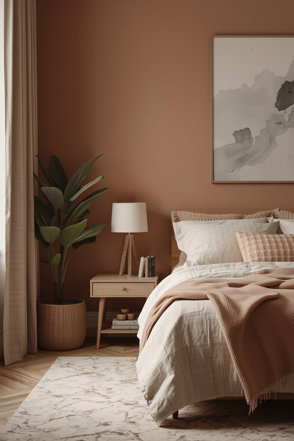
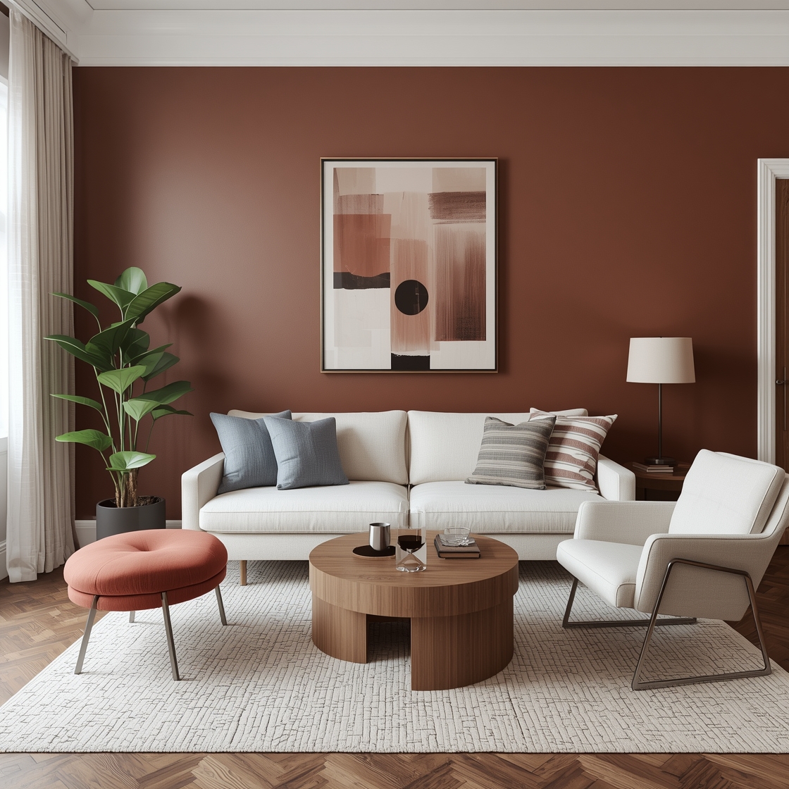
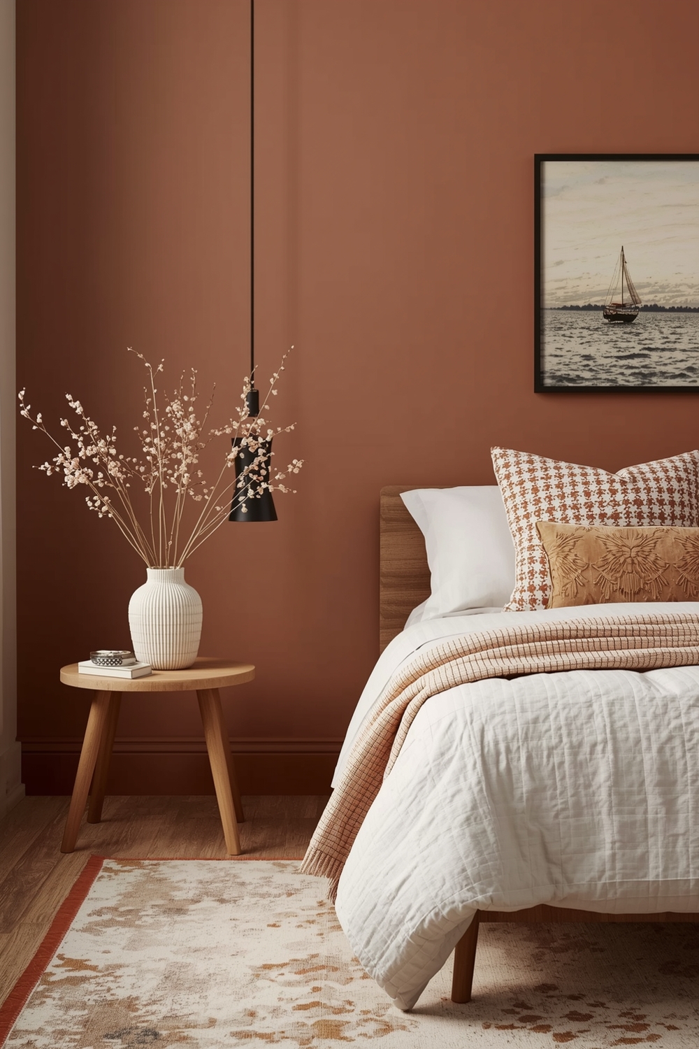
Creating cozy, intimate spaces requires thoughtful color selection. Warm hues like terracotta, rust, deep burgundy, and chocolate brown envelop rooms in comfort. These colors work particularly well in bedrooms, libraries, and smaller living areas where you want to foster feelings of security and relaxation.
Layer different warm tones to add richness without creating heaviness. Balance deeper colors with adequate lighting and lighter accents to prevent spaces from feeling closed in or cave-like.
Stylish Interior Room Paint Designs
Stylish paint designs go beyond simple solid colors to incorporate creative techniques like color blocking, ombré effects, and geometric patterns. These approaches allow you to make bold statements while still working within a cohesive palette. An adventurous Interior Paint Palette might feature a dramatic dark accent wall paired with lighter surrounding walls.
Two-tone walls, where the bottom half differs from the top, create visual interest and can make ceilings appear higher. Painted trim in contrasting colors adds architectural detail and personality to otherwise plain spaces.
Bright and Warm Room Paint Ideas
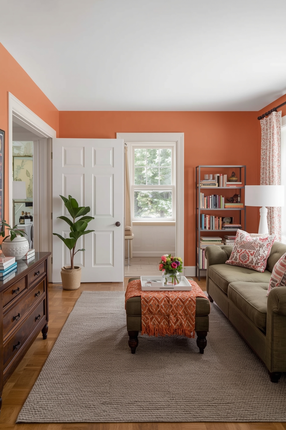
Bright, warm colors energize spaces and create cheerful atmospheres perfect for kitchens, playrooms, and creative studios. Sunny yellows, vibrant oranges, and coral pinks stimulate conversation and activity. These bold choices work best when balanced with neutral elements that prevent visual overwhelm.
Consider using bright colors on a single accent wall while keeping remaining walls neutral. This approach delivers personality without making spaces feel smaller. Warm whites with yellow undertones provide brightness without the commitment of truly bold color choices.
Contemporary Room Paint Layouts
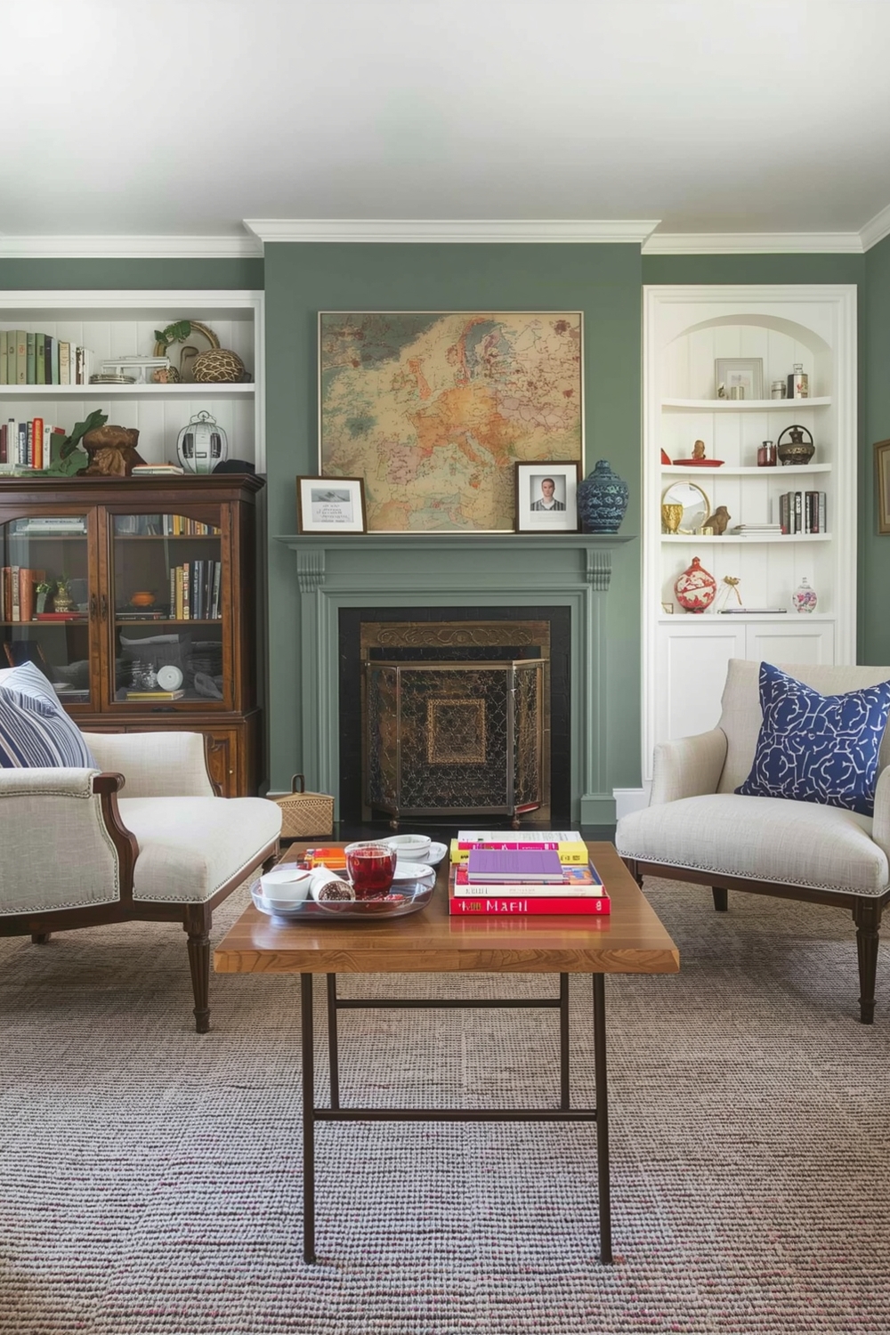
Contemporary design embraces current trends while maintaining timeless appeal. Today’s contemporary interior wall color ideas include sophisticated combinations like charcoal and blush, navy and cream, or forest green with warm wood tones.
These palettes feel fresh and current without being overly trendy. They provide excellent foundations that can be updated easily through accessories and furnishings as design trends evolve over time.
Accent Color Combinations for Rooms
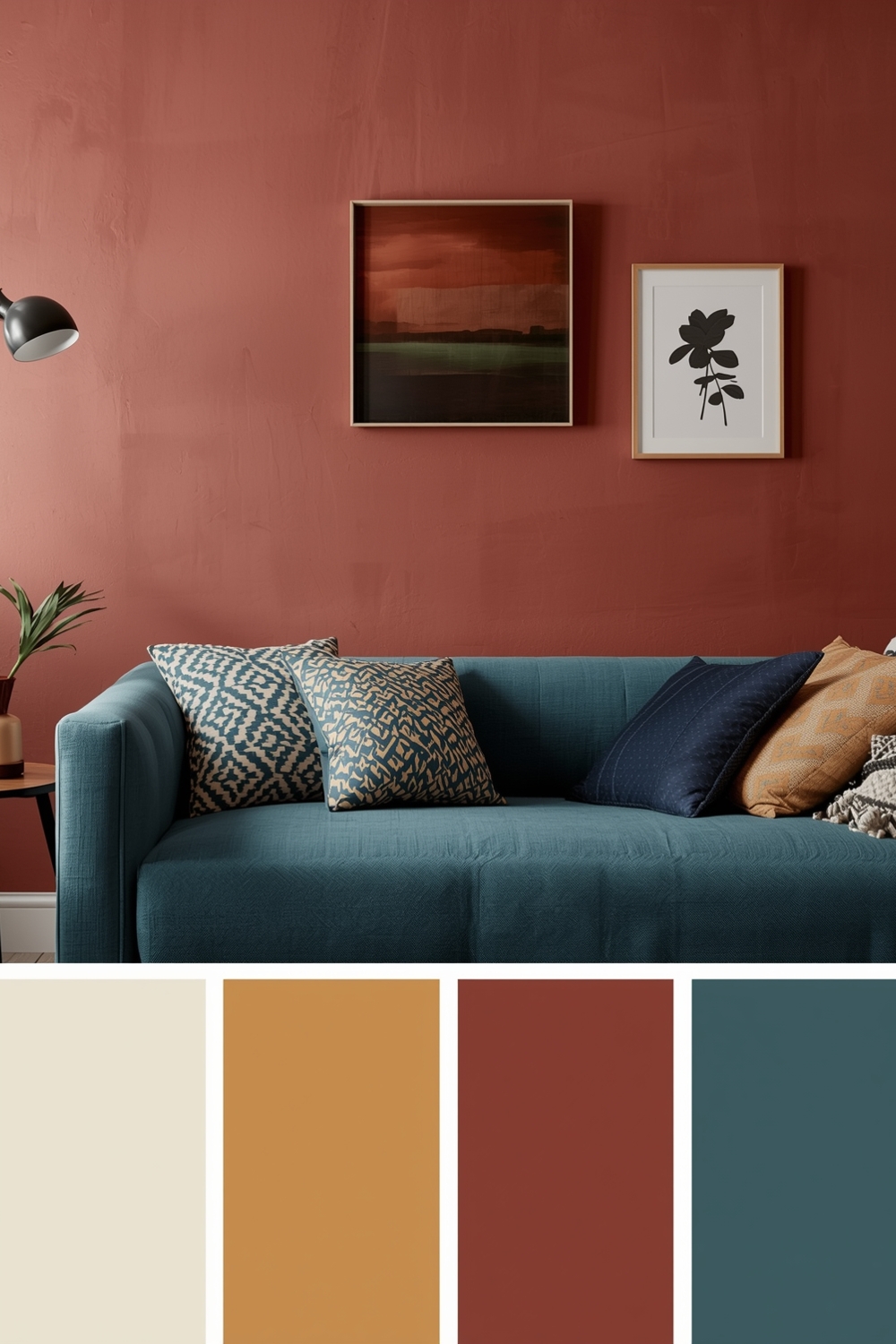
Strategic accent colors breathe life into neutral spaces. Your Interior Paint Palette should include one or two accent shades that create focal points and visual interest. Popular accent colors include deep teals, burnt oranges, mustard yellows, and rich burgundies that pop against neutral backgrounds.
Use accent colors on architectural features like built-in shelving, door frames, or single statement walls. This approach allows you to experiment with bolder choices without long-term commitment.
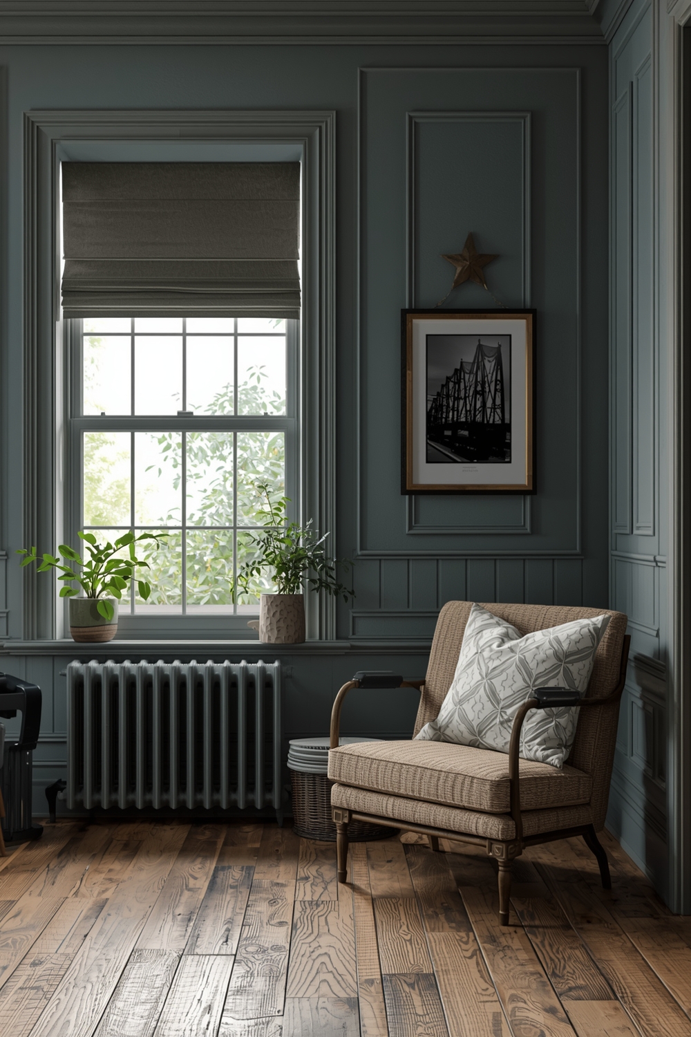
Timeless Room Paint Layouts
Timeless palettes transcend temporary trends, maintaining their appeal for decades. Classic combinations like soft gray with white trim, warm beige with cream accents, or gentle blue-gray with crisp white never go out of style. These enduring interior wall color ideas provide safe foundations that work with evolving décor preferences.
Investing in timeless colors makes practical sense for main living areas and hallways where you’re less likely to want frequent changes. Save bolder, trendier choices for smaller spaces like powder rooms or home offices where updates are easier and less expensive.
How This Idea Improves Your Space
Implementing a well-planned Interior Paint Palette dramatically improves your living environment. Cohesive color schemes make homes feel larger, more organized, and professionally designed. Proper color selection enhances natural light, influences mood, and creates visual flow between rooms. Strategic paint choices can even affect perceived room temperature, making spaces feel warmer or cooler as needed for comfort and energy efficiency.
Budget-Friendly Tips
Transform your space affordably by painting yourself rather than hiring professionals. Purchase paint during holiday sales, and start with high-impact areas like accent walls before committing to entire rooms. Sample pots allow experimentation without significant investment, helping you make confident decisions that avoid costly mistakes.
Conclusion
Selecting the perfect Interior Paint Palette requires balancing aesthetics, functionality, and personal preference. These 16 inspiring layouts demonstrate how thoughtful color selection transforms ordinary rooms into extraordinary spaces. Whether you prefer bold contemporary schemes or timeless neutral palettes, the right combination will enhance your home’s beauty and reflect your unique style perfectly.
FAQs
What is the 60-30-10 rule for interior paint palettes?
This design principle suggests using 60% of a dominant color, 30% of a secondary color, and 10% of an accent color to create balanced, visually appealing spaces.
How many colors should an interior paint palette include?
Most effective palettes include 3-5 colors: one dominant shade, one or two secondary colors, and one or two accent tones for visual interest.
Should all rooms in a house use the same paint palette?
While maintaining some color continuity creates flow, different rooms can have variations within the overall palette to suit their specific functions and personalities.
How do I choose between warm and cool paint colors?
Consider your room’s natural light and orientation. North-facing rooms benefit from warm colors, while south-facing spaces can handle cooler tones effectively.
What are the most timeless interior paint colors?
Soft grays, warm whites, beiges, and gentle blue-grays remain consistently popular and work well with changing décor trends over time.